Category: Visualizing English Print (VEP)

  • Latour, the Digital Humanities, and the Divided Kingdom of Knowledge

    conference_2015
    Participants in “Recomposing the Humanities,” September 2015. Pictured from left to right: Barbara Herrnstein Smith, Rita Felski, Bruno Latour, Nigel Thrift, Michael Witmore, Dipesh Chakrabarti, and Stephen Muecke.


    Published last week, “Latour, the Digital Humanities, and the Divided Kingdom of Knowledge” is an article developed from the Recomposing the Humanities Conference sponsored by New Literary History at the University of Virginia in September of 2015. Supplemental digital media for the article can be found here.

    Abstract: Talk about the humanities today tends to focus on their perceived decline at the expense of other, more technical modes of inquiry. The big S “sciences” of nature, we are told, are winning out against the more reflexive modes of humanistic inquiry that encompass the study of literature, history, philosophy, and the arts. This decline narrative suggests we live in a divided kingdom of disciplines, one composed of two provinces, each governed by its own set of laws. Enter Bruno Latour, who, like an impertinent Kent confronting an aging King Lear, looks at the division of the kingdom and declares it misguided, even disastrous. Latour’s narrative of the modern bifurcation of knowledge sits in provocative parallel with the narrative of humanities-in-decline: what humanists are trying to save (that is, reflexive inquiry directed at artifacts) was never a distinct form of knowledge. It is a province without borders, one that may be impossible to defend. We are now in the midst of a further plot turn with the arrival of digital methods in the humanities, methods that seem to have strayed into our province from the sciences. As this new player weaves in and out of the plots I have just described, some interesting questions start to emerge. Does the use of digital methods in the humanities represent an incursion across battle lines that demands countermeasures, a defense of humanistic inquiry from the reductive methods of the natural or social sciences? Will humanists lose something precious by hybridizing with a strain of knowledge that sits on the far side of the modern divide? What is this precious thing that might be lost, and whose is it to lose?

  • Supplemental Media for “Latour, the Digital Humanities, and the Divided Kingdom of Knowledge”

    screen-shot-2016-09-22-at-8-07-56-pmThe data and texts found in this post serve as a companion to my article, “Latour, the Digital Humanities, and the Divided Kingdom of Knowledge” which appears in a special issue of New Literary History, 2016, 47:353-375.

    The analysis presented in the article is based on a set of texts that were tagged (features were counted) using a tool called Ubiq+Ity, which counts features in texts specified by users or those captured a default feature-set known as Docuscope. The tool’s creation and associated research was funded by the Mellon Foundation under the “Visualizing English Print, 1530-1800” grant.

    From this post, users can find the source texts, tagging code, data, and “marked up” Shakespeare plays as HTML documents (documents that show where the features “if” “and” or “but” occur in each of the 38 plays). The source texts were taken from the API created at the Folger Shakespeare Library for the Folger Editions, which are now available online. Thirty-eight Shakespeare plays were extracted from these online editions, excluding speech prefixes and stage directions, and then lightly curated (replacement of smart apostrophe with a regular one, emendation of é to e, insertion of spaces before and after em-dashes). Those texts were then uploaded in a zipped folder to Ubiq+Ity, along with a custom rules .csv that specified the features to be counted in this corpus (if, and, but). Once tagged, Ubiqu+Ity returned a .csv file containing the percentage counts for all of the plays. (I have removed some of the extraneous columns that do not pertain to the analysis, and added the genre medatata discussed in the article.) Ubiq+Ity also returned a set of dynamically annotated texts — HTML files of each individual play — that can be viewed on a browser, turning on and off the three features so that readers can see how and where they occur in the plays. Data from the counts were then visualized in three dimensions using the statistical software package JMP, which was also used to perform Student’s t-test. All of the figures from the article can be found here.

  • Data and Metadata

    (Post by Jonathan Hope and Beth Ralston; data preparation by Beth Ralston.)

    It is all about the metadata. That and text processing. Currently (July 2015) Visualising English Print (Strathclyde branch) is focussed on producing a hand-curated list of all ‘drama’ texts up to 1700, along with checked, clean metadata. Meanwhile VEP (Wisconsin branch) works on text processing (accessing TCP texts in a suitable format, cleaning up rogue characters, splitting up collected volumes into individual plays, stripping-out speech prefixes and non-spoken text, modernising/regularising).

    We are not the only people doing this kind of work on Early Modern drama: Meaghan Brown at The Folger Shakespeare Library is working on a non-Shakespearean corpus, and Martin Mueller has just released the ‘Shakespeare His Contemporaries’ corpus. We’ve been talking to both, and we are very grateful for their help, advice, and generosity with data. In a similar spirit, we are making our on-going metadata collections available – we hope they’ll be of use to people, and that you will let us know of any errors and omissions.

    You are welcome to make use of this metadata in any way you like, though please acknowledge the support of Mellon to VEP if you do, and especially the painstaking work of Beth Ralston, who has compared and cross-checked the various sources of information about Early Modern plays.

    We hope to be in a position to release tagged texts once we have finalised the make-up of the corpus, and established our processing pipeline. Watch this space.

    Many of the issues surrounding the development of usable corpora from EEBO-TCP will be discussed at SAA in 2016 in a special plenary round-table:

    SAA session


    In preparing these lists of plays and metadata we have made extensive use of Martin Wiggins and Catherine Richardson, British Drama 1533-1642: A Catalogue (Oxford), Alfred Harbage, Annals of English Drama 975-1700, the ESTC, and, most of all,  Zach Lesser and Alan Farmer’s DEEP (Database of Early English Playbooks).

    Definitions and History 

    One of the usefully bracing things about digital work is that it forces you to define your terms precisely – computers are unforgiving of vagueness, so a request for a corpus of ‘all’ Early Modern drama turns out to be no small thing. Of course everyone defines ‘all’, ‘Early Modern’ and ‘drama’ in slightly different ways – and those using these datasets should be aware of our definitions, and of the probability that they will want to make their own.

    The current cut-off date for these files is the same as DEEP – 1660 (though one or two post-1660 plays have sneaked in). Before long, we will extend them to 1700.

    By ‘drama’ we mean plays, masques, and interludes. Some dialogues and entertainments are included in the full data set, but we have not searched deliberately for them. We have included everything printed as a ‘play’, including closet dramas not intended for performance.

    The immediate history of the selection is that we began with a ‘drama’ corpus chosen automatically by Martin Mueller (using XML tags in the TCP texts to identify dramatic genres). Beth Ralston then checked this corpus against the reference sources listed above for omissions, adding a considerable number of texts. This should not be regarded as ‘the’ corpus of Early Modern drama: it is one of many possible versions, and will continue to change as more texts are added to TCP (there are some transcriptions still in the TCP pipeline, and scholars are working on proposals to continue transcription of EEBO texts after TCP funding ends).

    It is likely that each new scholar will want to re-curate a drama corpus to fit their research question – VEP is working on tools to allow this to be done easily.

    Files and corpora

    1    The 554 corpus

    This spreadsheet lists only what we regard as the ‘central’ dramatic texts: plays.

    Entertainments, masques, interludes, and dialogues are not included. We have also excluded around 35 play transcriptions in TCP which duplicate transcriptions of the same play made from different volumes (usually a collected edition and a stand-alone quarto).

    The spreadsheet includes frequency counts for Docuscope LATs, tagged by Ubiquity, which can be visualised using any statistical analysis program (columns W-EE). For a descriptive list of the LATs, see <Docuscope LATs: descriptions>. For a description of all columns in the spreadsheet, see the <READ ME> file.

    [In some of their early work, Hope and Witmore used a corpus of 591 plays which included these duplicates.]

    554 metadata

    README for 554 metadata

    Docuscope LATs: descriptions 


    2   The 704 corpus

    The 704 corpus spreadsheet lists information for the 554 plays included above, and adds other types of dramatic text, such as masques, entertainments, dialogues, and interludes (mainly drawn from DEEP, and with the same date cut-off: 1660). This corpus also includes the 35 duplicate transcriptions excluded from the 554 spreadsheet.

    Docuscope frequency counts are only available for items also in the 554 spreadsheet.

    704 metadata

    README for 704 metadata


    3  The master metadata spreadsheet

    Our ‘master metadata’ spreadsheet is intended to be as inclusive as possible. The current version has 911 entries, and we have sought to include a listing for every extant, printed ‘dramatic’ work we know about up to 1660 (from DEEP, Harbage, ESTC, and Wiggins). The spreadsheet does not include every edition of every text, but it does include the duplicate texts found in the 704 corpus. (When we extend the cut-off date to 1700, we expect the number of entries in this spreadsheet to exceed 1500.)

    This master list includes all the texts in the 704 list (and therefore the 554 list as well). But it also includes:
    • plays which are in TCP but which do not appear in the 554 or 704 corpora (i.e. they were missed first time round). These texts have ‘yes’ in the ‘missing from both’ column (M) of the master spreadsheet.
    • plays which are absent from TCP at this time (we note possible reasons for this: some are in Latin, some are fragments, and we assume some have yet to be transcribed). These are texts which have ‘yes’ listed in the ‘missing from both’ column (M) of the master spreadsheet, as well as ‘not in tcp’ listed in the ‘tcp’ column (A).

    master metadata

    README for master metadata


    TCP transcriptions

    TCP is one of the most important Humanities projects ever undertaken, and scholars should be grateful for the effort and planning that has gone into it, as well as the free release of its data. It is not perfect however: as well as the issue of texts being absent from TCP, we are also currently dealing with problematic transcriptions on a play-by-play basis. Take Jonson’s 1616 folio (TCP: A04632, ESTC: S112455) for example – it has a very fragmentary transcription, especially during the masques.

    page 1
    First page of The Irish Masque


    In the above image from The Irish Masque, you can see on the right-hand side that the text for this page is not available.

    page 2
    Second page of The Irish Masque

    …However, on the next page the text is there (as far as we can work out, this seems to be due to problems with the original imaging of the book, rather than the transcribers).

    Texts with fragmentary transcriptions have been excluded for now, assuming that at some point in the future TCP will re-transcribe them.

    As we come across other examples of this, we will add them to page

  • Finding “Distances” Between Shakespeare’s Plays 1

    swallows-300x199In honor of the latest meeting of our NEH sponsored Folger workshop, Early Modern Digital Agendas, I wanted to start a series of posts about how we find “distances” between texts in quantitative terms, and about what those distances might mean. Why would I argue that two texts are “closer” to one another than they are to a third that lies somewhere else? How do those distances shift when they are measured on different variables? When represented as points in different dataspaces, the distances between texts can shift as variables change — like a murmuration of starlings. So what kind of cloud is a cloud of texts?

    This first post begins with some work on the Folger Digital Texts of Shakespeare’s plays, which I’m making available in “stripped” form here. These texts were created by Mike Poston, who developed the encoding scheme for Folger Digital Texts, and who understands well the complexities involved in differentiating between the various encoded elements of a play text.

    I’ve said the texts are “stripped.” What does that mean? It means that we have eliminated those words in the Folger Editions that are not spoken by characters. Speech prefixes, paratextual matter, and stage directions are absent from this corpus of Shakespeare plays. There are interesting and important reasons why these portions of the Editions are being set aside in the analyses that follow, and I may comment on that issue at a later date. (In some cases, stripping will even change the “distances” between texts!) For now, though, I want to run through a sequence of analyses using a corpus and tools that are available to as many people as possible. In this case that means text files, a web utility, and in subsequent posts on “dimension reduction,” an excel spreadsheet alongside some code written for the statistics program R.

    The topic of this post, however, is “distance” — a term well worth thinking about as our work moves from corpus curation through the “tagging” of the text and on into analysis. As always, the goal of this work is to do the analysis and then return to these texts with a deepened sense of how they achieve their effects — rhetorically, linguistically, and by engaging aesthetic conventions. It will take more than one post to accomplish this full cycle.

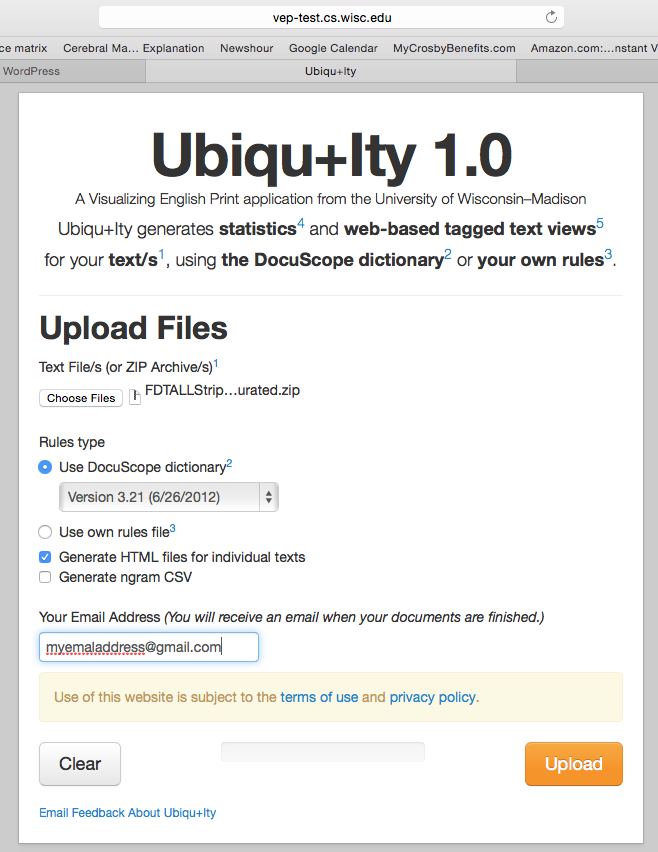
    So, we take the zipped corpus of stripped Folger Edition plays and upload it to the online text tagger, Ubiqu+ity. This tagger was created with support from the Mellon Foundation’s Visualizing English Print grant at the University of Wisconsin, in collaboration with the creators of the text tagging program Docuscope at Carnegie Mellon University. Uniqu+ity will pass a version of Docuscope over the plays, returning a spreadsheet with percentage scores on the different categories or Language Action Types (LATs) that Docuscope can tally. In this case, we upload the stripped texts and request that they be tagged with the earliest version of Docuscope available on the site, version 3.21 from 2012. (This is the version that Hope and I have used for most of our analyses in our published work. There may be some divergences in actual counts, as this is a new implementation of Docuscope for public use. But so far the results seem consistent with our past findings.) We have asked Ubiqu+ity to create a downloadable .csv file with the Docuscope counts, as well as a series of HTML files (see the checked box below) that will allow us to inspect the tagged items in textual form.


    Screen Shot 2015-06-22 at 9.02.58 PM

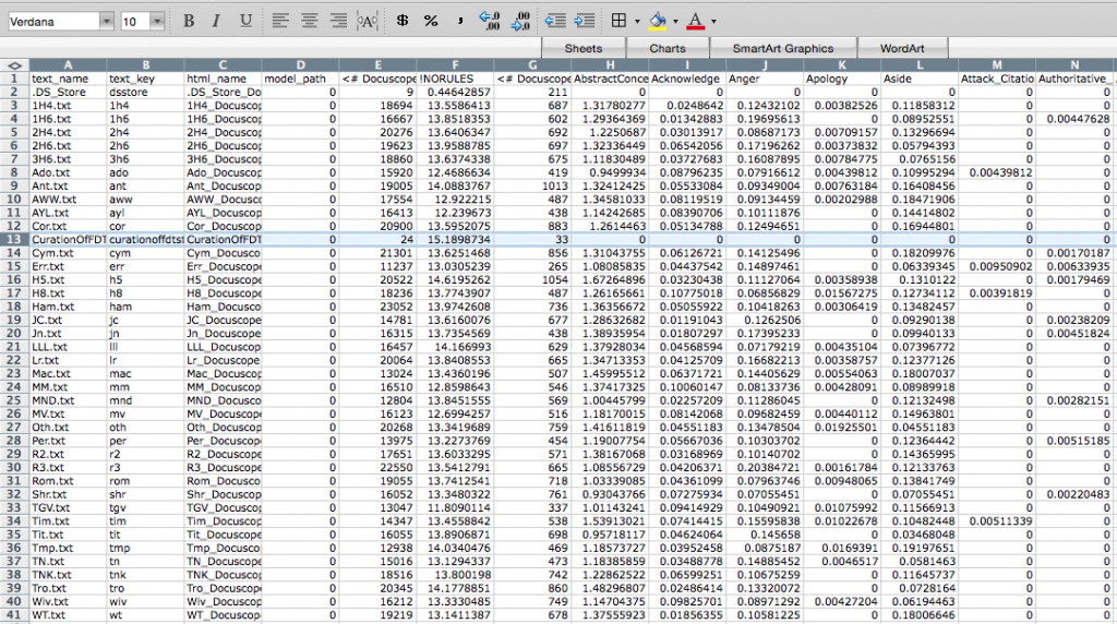
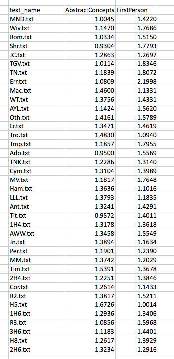
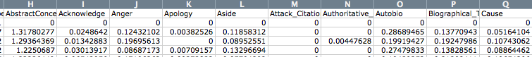
    The results can be downloaded here, where you will find a zipped folder containing the .csv file with the Docuscope counts and the HTML files for all the stripped Folger plays. The .csv file will look like the one below, with abbreviated play names arrayed vertically in the first column, then (moving columnwise to the right) various other pieces of metadata (text_key, html_name, and model_path), and finally the Docuscope counts, labelled by LAT. You will also find that a note on curation was fed into the program. I will want to remove this row when doing the analysis.

    Screen Shot 2015-06-23 at 8.35.34 AM

    For ease of explication, I’m going to pare down these columns to three: the name of the text in column 1, and then the scores that sit further to the right on the spreadsheet for two LATs: AbstractConcepts and FirstPerson. These scores are expressed as a proportion, which to say, the number of all tokens tagged under this LAT as a fraction of all the included tokens. So now we are looking at something like this:

    Screen Shot 2015-06-22 at 9.20.00 PM

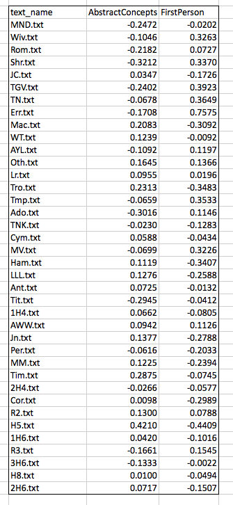
    Before doing any analysis,  I will make one further alteration, subtracting the mean value for each column (the “average” score for the LAT) from every score in that column. I do this in order to center the data around the zero point of both axes:

    Screen Shot 2015-06-22 at 9.43.18 PMNow some analysis. Having identified a corpus (Shakespeare’s plays) and curated our texts (stripping, processing), we have counted some agreed upon features (Docuscope LATs). The features upon which we are basing the analysis are those words or strings of words that Docuscope counts as AbstractConcepts and FirstPerson tokens.

    It’s important to note that at any point in this process, we could have made different choices, and that these choices would have lead to different results. The choice of what to count is a vitally important one, so we ought to give thought to what Douscope counted as FirstPerson and AbstractConcepts. To get to know these LATs better — to understand what exactly has been assigned these two tags —we can open one of the HTML files of the plays and “select” that category on the right hand side of the page, scrolling through the document to see what was tagged. Below is the opening scene of Henry V, so tagged:

    Screen Shot 2015-06-23 at 8.28.10 AM


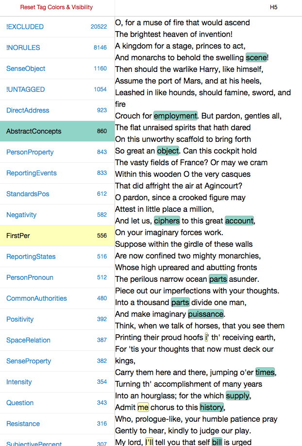
    Before doing the analysis, we will want explore the features we have been counting by opening up different play files and turning different LATs “on and off” on the left hand side of the HTML page. This is how we get to know what is being counted in the columns of the .csv file.

    I look, then, at some of our texts and the features that Ubiqu+ity tagged within them. I will be more or less unsatisfied with some of these choices, of course. (Look at “i’ th’ receiving earth”!)Because words are tagged according to inflexible rules, I will disagree with some of the things that are being included in the different categories. That’s life. Perhaps there’s some consolation in the fact that the choices I disagree with are, in the case of Docuscope, (a) relatively infrequent and (b) implemented consistently across all of the texts (wrong in the same way across all types of document). If I really disagree, I have the option of creating my own text tagger. In practice, Hope and I have found that it is easier to continue to use Docuscope, since we do not want to build into the tagging scheme the self-evident things we may be interested in. It’s a good thing that Docuscope remains a little bit alien to us, and to everyone else who uses it.

    Now to the question of distance.

    Screen Shot 2015-06-22 at 10.01.43 PM
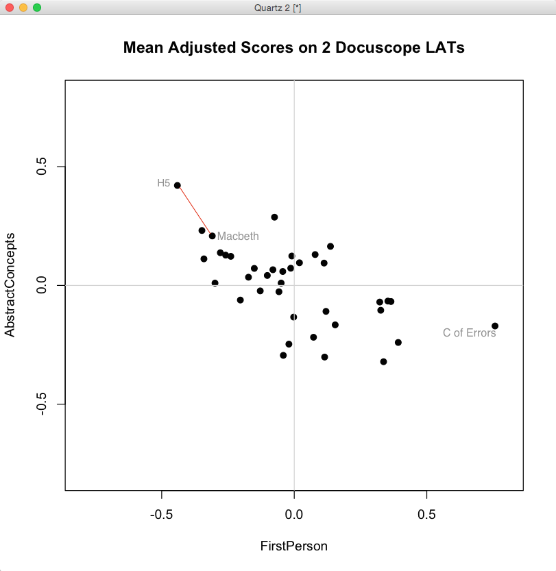
    When we look at the biplot above, generated in R from the mean-adjusted data above, we notice a general shape to the data. We could use statistics to describe the trend — there is a negative covariance between FirstPerson and AbstractConcept LATs — but we can already see that as FirstPerson tokens increase, the proportion of AbstractConcept tokens tends to decrease. The trend is a rough one, but there is the suggestion of a diagonal line running from the upper left hand side of the graph toward the lower right.

    What does “distance” mean in this space? It depends on a few things. First, it depends on how the data is centered. Here we have centered the data by subtracting the column means from each entry. Our choice of a scale on either axis will also affect apparent distances, as will our choice of the units represented on the axes. (One can tick off standard deviations around the mean, for example, rather than the original units, which we have not done). These contingencies point up an important fact: distance is only meaningful because the space is itself meaningful — because we can give a precise account of what it means to move an item up or down either of these two axes.

    Just as important: distances in this space are a caricature of the linguistic complexity of these plays. We have strategically reduced that complexity in order to simplify a set of comparisons. Under these constraints, it is meaningful to say that Henry V is “closer” to Macbeth than it is to Comedy of Errors. In the image above, you can compare these distances between the labelled texts. The first two plays, connected by the red line, are “closer” given the definitions of what is being measured and how those measured differences are represented in a visual field.

    When we plot the data in a two dimensional biplot, we can “see” closeness according to these two dimensions. But if you recall the initial .csv file returned by Ubiq+ity, you know that there can be many more columns — and so, many more dimensions — that can be used to plot distances.

    Screen Shot 2015-06-23 at 8.56.23 AM

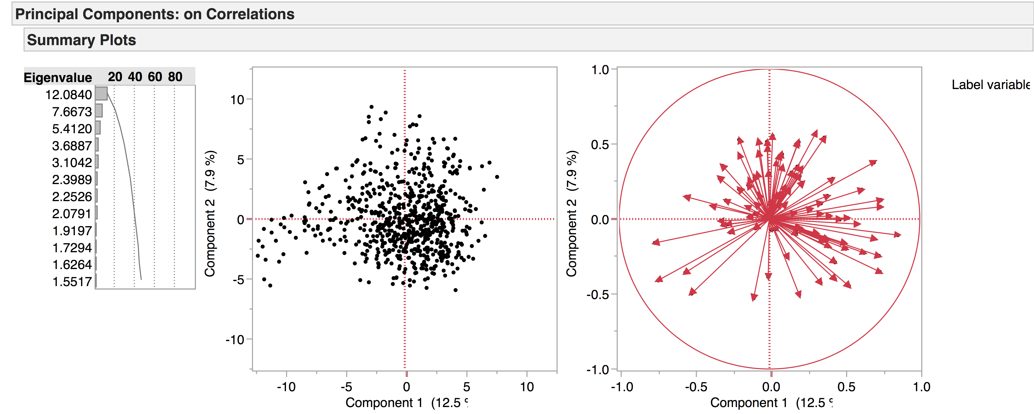
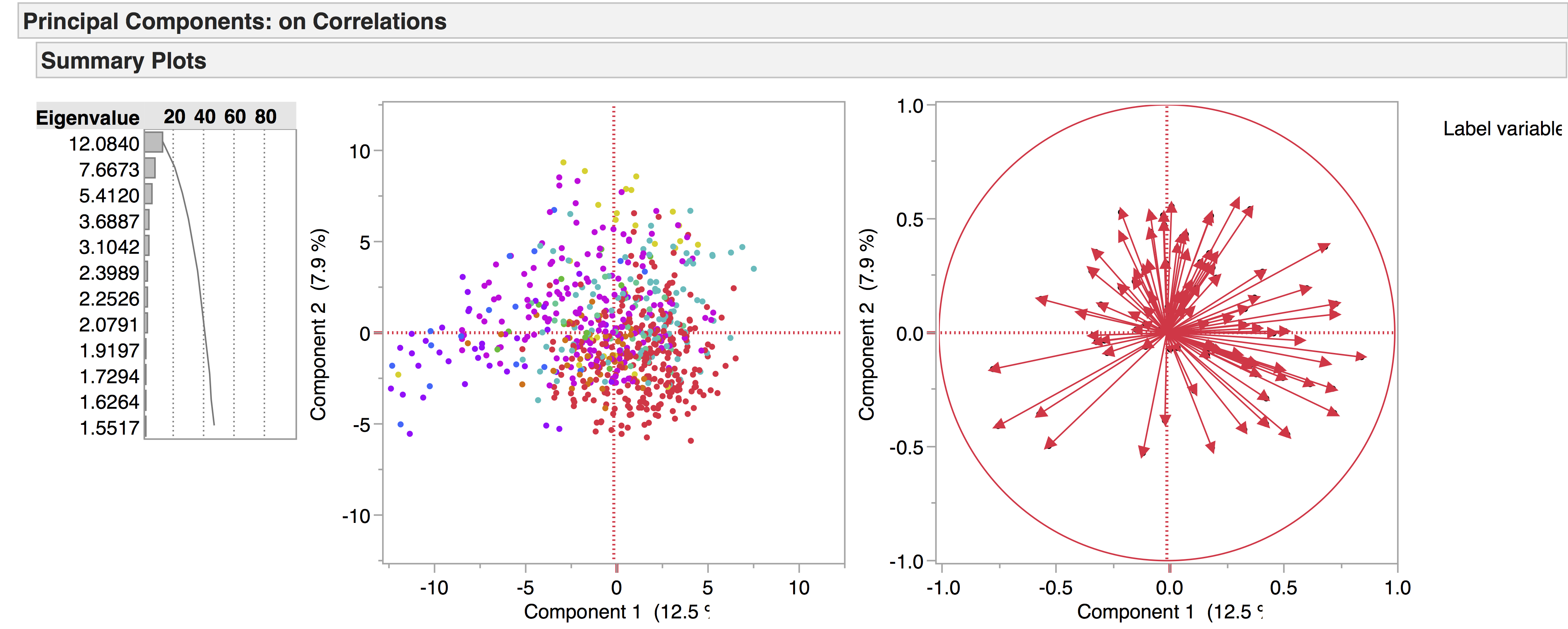
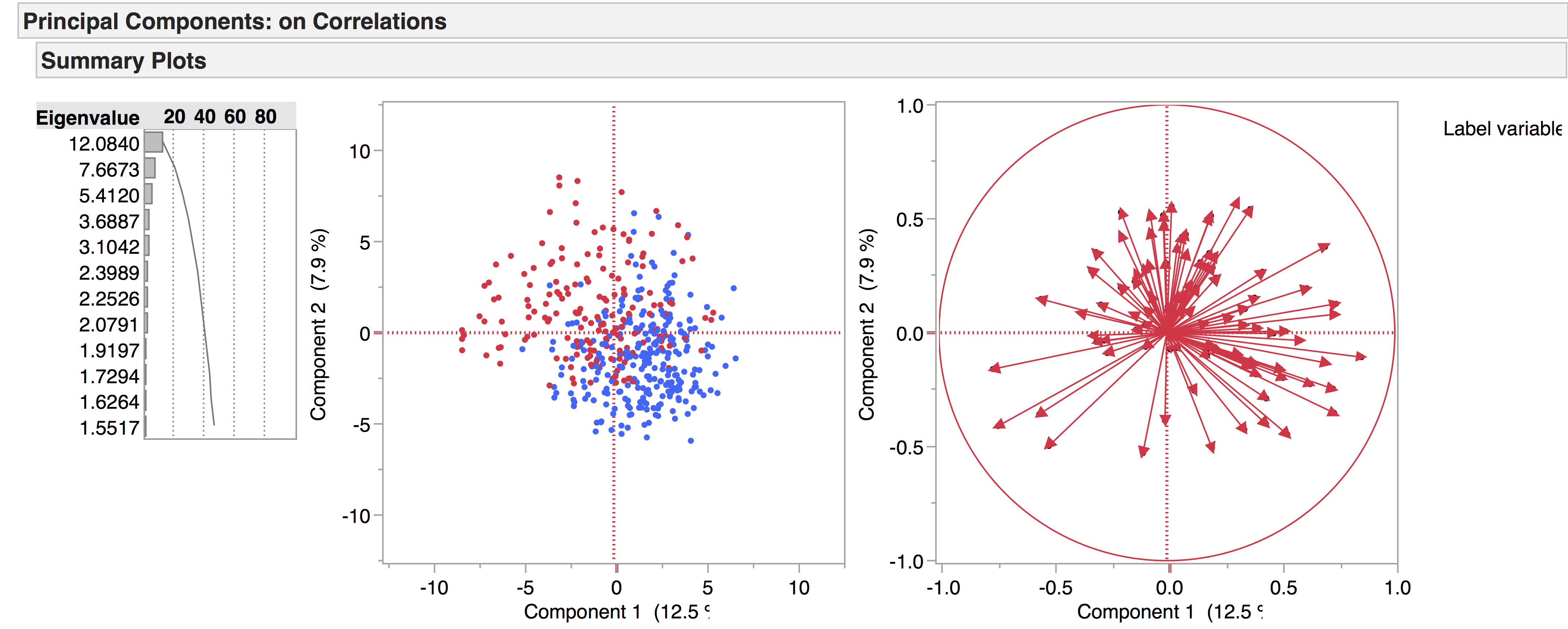
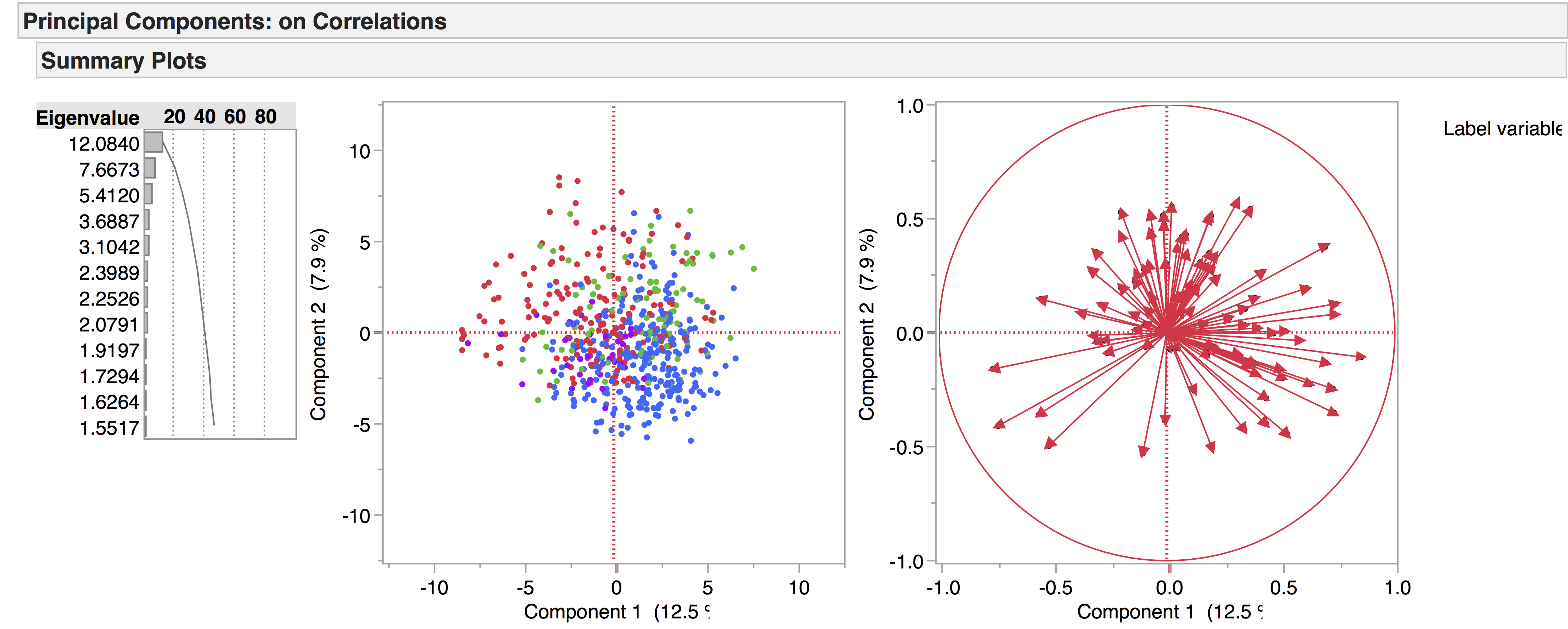
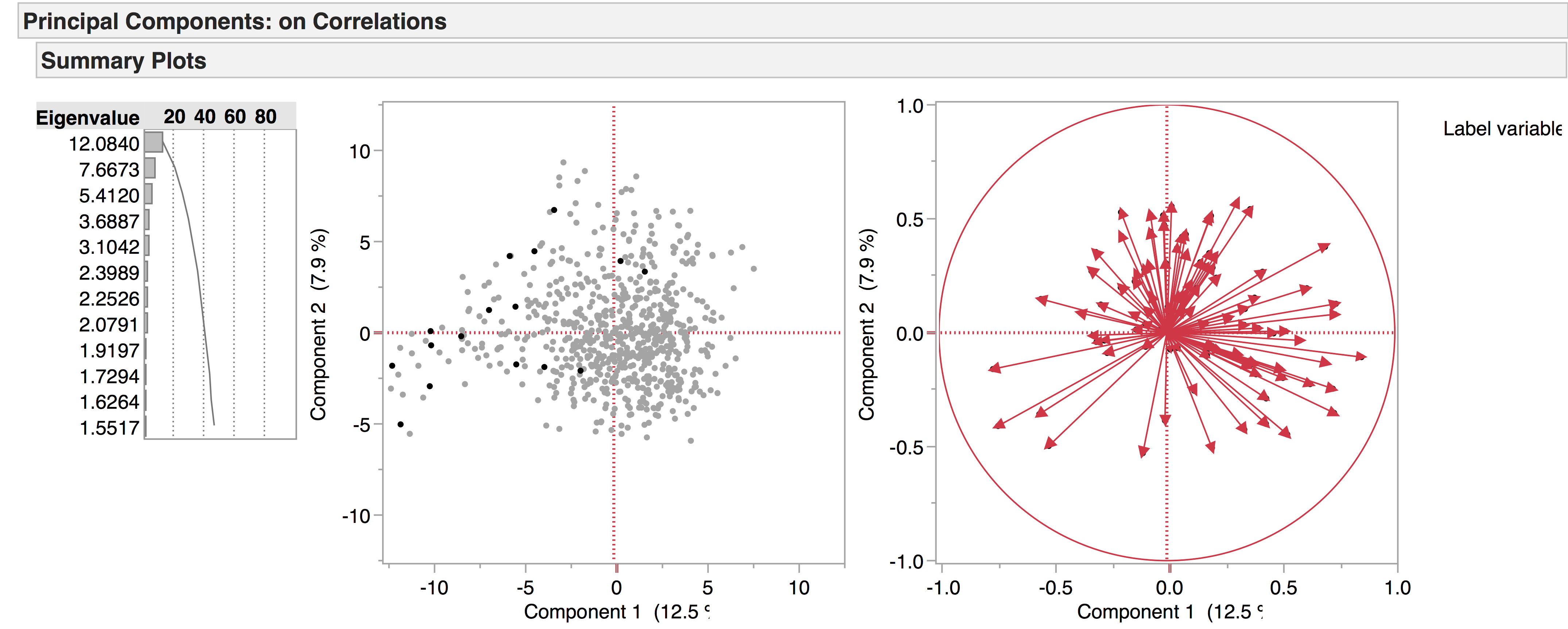
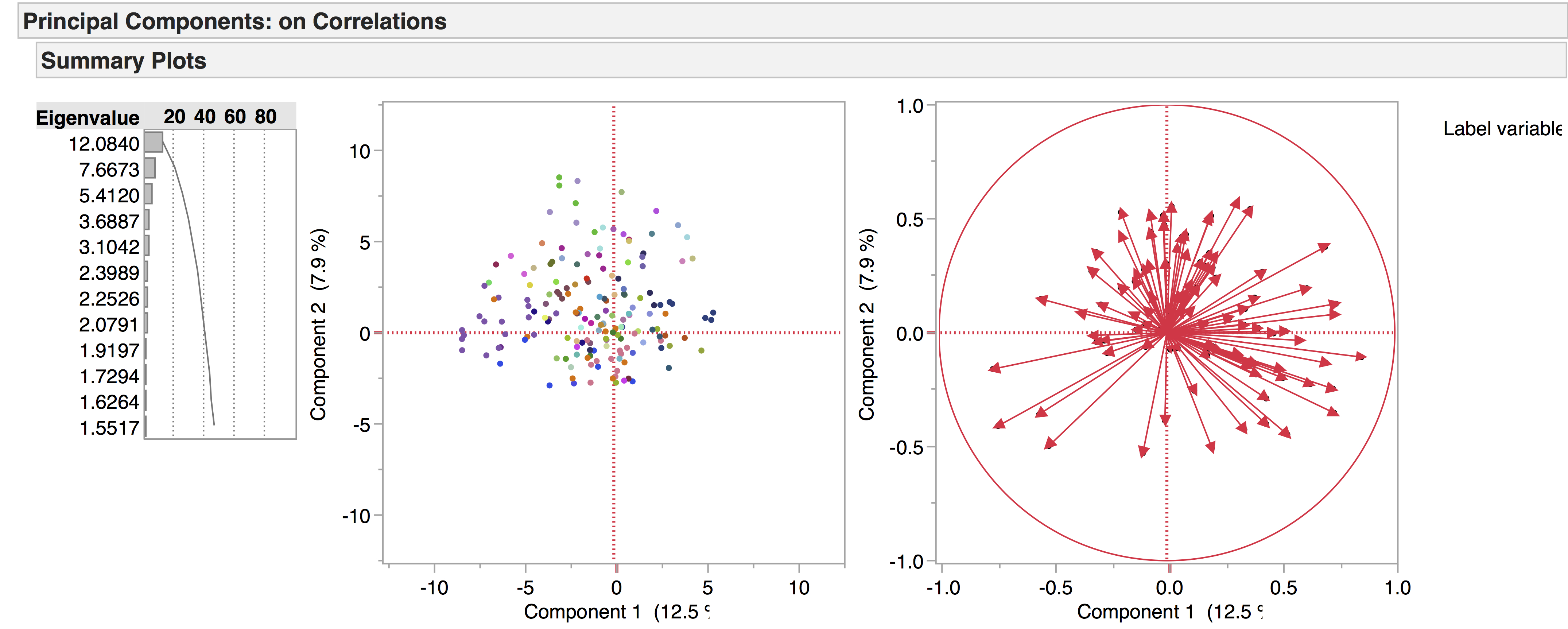
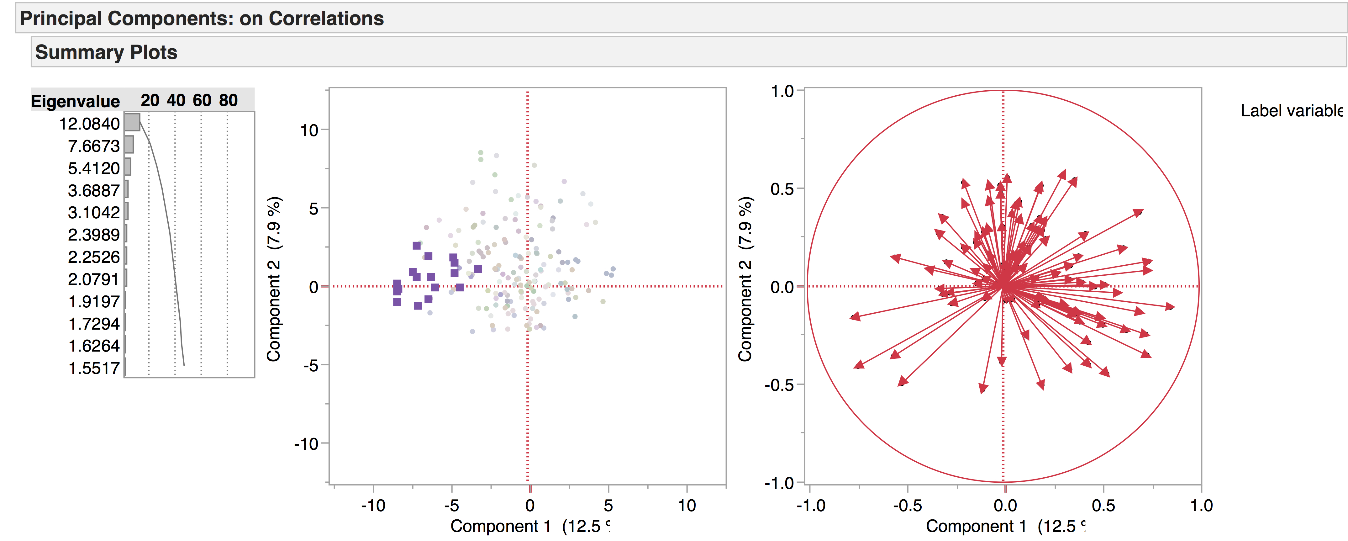
    What if we had scattered all 38 of our points (our plays) in a space that had more than the two dimensions shown in the biplot above? We could have done so in three dimensions — plotting three columns instead of two — but once we arrive at four dimensions we are beyond the capacity for simple visualization.  Yet there may be a similar co-paterning (covariance) among LATs in these higher dimensional spaces, analogous to the ones we can “see” in two dimensions. What if , for example,the frequency of Anger decreases alongside that of AbstractConcepts just when FirstPerson instances increase? How should we understand the meaning of comparatives such as “closer together” and “further apart” in such multidimensional spaces? For that, we need techniques of dimension reduction.

    In the next post, I will describe my own attempts to understand a common technique for dimension reduction known as Principal Component Analysis. It took about two years for me to figure that out, however imperfectly. I wanted to pass that along in case others are curious. But it is important to understand that these more complex techniques are just extensions of something we can imagine in more simpler terms. And it is important to remember that there are very simple ways of visualizing distance — for example, an ordered list. We assessed distance visually in the biplot above, a distance that was measured according to two variables or dimensions. But we could have just as easily used only one dimension, say, Abstract Concepts. Here is the list of Shakespeare’s plays, in descending order, with respect to scores on AbstractConcepts:

    Screen Shot 2015-06-23 at 9.04.56 AM

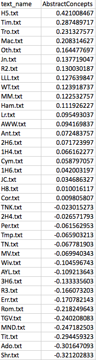
    Even if we use only one dimension here, we can see once again that Henry V is “closer” to Macbeth than it is to Comedy of Errors. We could even remove the scores and simply use an ordinal sequence of this play, then this, then this. There would still be information about “distances” in this very simple, one dimensional, representation of the data.

    Now we ask ourselves: which way of representing the distances between these tests is better? Well, it depends on what you are trying to understand, since distances — whether in one, two, or many more dimensions — are only distances according to the variables or features (LATs) that have been measured. In the next post, I’ll try to explain how the thinking above helped me understand what is happening in a more complicated form of dimension reduction called Principal Component Analysis. I’ll use the same mean adjusted data for FirstPerson and AbstractConcepts discussed here, providing the R code and spreadsheets so that others can follow along. The starting point for my understanding of PCA is an excellent tutorial by Jonathon Shlens, which will be the underlying basis for the discussion.


  • Mapping the ‘Whole’ of Early Modern Drama

    We’re currently working with two versions of our drama corpus: the earlier version contains 704 texts, while the later one has 554, the main distinction being that the later corpus has a four-way genre split – tragedy, comedy, tragicomedy, and history – while the earlier corpus also includes non-dramatic texts like dialogues, entertainments, interludes, and masques. Recently we’ve been doing PCA experiments with the 704 corpus to see what general patterns emerge, and to see how the non-dramatic genres pattern in the data. The following are a few of the PCA visualisations generated from this corpus, which provide a general overview of the data. We produced the diagrams here using JMP. The spreadsheets of the 704 and 554 corpora are included below as excel files – please note we are still working on the metadata.

    704 corpus

    554 corpus


    Overview (click to enlarge images):

    overall PCA space copy

    This is the complete data set visualised in PCA space. All 704 plays are included, but LATs with frequent zero values have been excluded.


    Genre:

    If we highlight the genres, it looks like this:

    all genres copy

    Comedies = red

    Dialogues = green

    Entertainments = blue

    Histories = orange

    Interludes = blue-green

    Masques = dark purple

    Non-dramatics = mustard

    Tragicomedies = dark turquoise

    Tragedies = pink-purple


    If we tease this out even more – hiding, but not excluding, the non-dramatic genres – there is a clear diagonal divide between tragedies (red) and comedies (blue):

    [Michael Witmore, Jonathan Hope, and Michael Gleicher, forthcoming, ‘Digital Approaches to the Language of Shakespearean Tragedy’, in Michael Neill and David Schalkwyk, eds, The Oxford Handbook of ShakespeareanTragedy (Oxford)]

    TR CO split copy

    With tragicomedies (green) and histories (purple) falling in the middle:

    TR CO TC HI split copy

    It seems that tragedies and comedies are characterised by sets of opposing LATs. The LATs associated with comedy are those capturing highly oral language behaviour, while those associated with tragedy capture negative language and psychological states. Tragicomedies and histories – although we have yet to investigate them in detail – seem to occupy an intermediate space. If we unhide the non-dramatic genres, we can see how they pattern in comparison.

    In spite of their name, dialogues are not comprised of rapid exchanges (e.g. Oral Cues, Direct Address, First Person etc., the LATs which make up the comedic side of the PCA space) but instead have lengthy monologues, which might explain why they fall mostly on the side of the tragedies:

    DI copy

    Entertainments do not seem to be linguistically similar to each other:

    EN copy

    Interludes, on the other hand, seem to occupy a more tightly defined linguistic space:

    IN copy

    Masques are pulled towards the left of the PCA space:

    MA copy


    Authorship:

    Docuscope was designed to identify genre, rather than authorship, so perhaps we should not be surprised that authorship comes through less clearly than genre in these initial trials. We should also bear in mind that there are only 9 genres in the corpus, compared to approximately 200 authors.

    This, for example, shows only the tragedies – all other genres are hidden – and each author is represented by a different colour:

    TR authorship copy

    We get a clearer picture when considering a smaller group in relation to the whole – for example, one author compared to all the others. Take Seneca, for example – demonstrated by the purple squares:

    TR Seneca copy

    From this we can deduce that Seneca’s tragedies are linguistically similar, as they are grouped tightly together.


    Date:

    The same applies for looking at date of writing across the corpus, with approximately 100 dates to consider.

    This can be visualised on a continuous scale, e.g. the lighter the dot, the earlier the play; the darker the dot, the later the play. While this has a nice ‘heat map’ effect, it is difficult to interpret:

    date continuous scale copy

    If we narrow this down to three groups of dates – early (red), central (yellow), and late (maroon) – it becomes a little easier to read. As with the Seneca example, the fewer factors there are to consider, the clearer the visualisations become:

    early central late split copy