Author: Michael Witmore

  • Finding “Distances” Between Shakespeare’s Plays 2: Projecting Distances onto New Bases with PCA

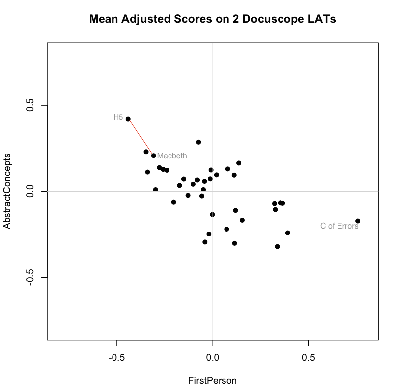
    It’s hard to conceive of distance measured in anything other than a straight line. The biplot below, for example, shows the scores of Shakespeare’s plays on the two Docuscope LATs discussed in the previous post, FirstPerson and AbstractConcepts:

    BScreen-Shot-2015-06-22-at-10.01.43-PM2-e1435899027618Plotting the items in two dimensions gives the viewer some general sense of the shape of the data. “There are more items here, less there.” But when it comes to thinking about distances between texts, we often measure straight across, favoring either a simple line linking two items or a line that links the perceived centers of groups.

    The appeal of the line is strong, perhaps because it is one dimensional. And brutally so. We favor the simple line because want to see less, not more. Even if we are looking at a biplot, we can narrow distances to one dimension by drawing athwart the axes. The red lines linking points above — each the diagonal of a right triangle whose sides are parallel to our axes — will be straight and relatively easy to find. The line is simple, but its meaning is somewhat abstract because it spans two distinct kinds of distance at once.

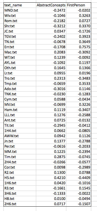
    Distances between items become slightly less abstract when things are represented in an ordered list. Scanning down the “text_name” column below, we know that items further down have less of the measured feature that those further up. There is a sequence here and, so, an order of sorts:

    Screen Shot 2015-07-03 at 9.49.01 AM

    If we understand what is being measured, an ordered list can be quite suggestive. This one, for example, tells me that The Comedy of Errors has more FirstPerson tokens than The Tempest. But it also tells me, by virtue of the way it arranges the plays along a single axis, that the more FirstPerson Shakespeare uses in a play, the more likely it is that this play is a comedy. There are statistically precise ways of saying what “more” and “likely” mean in the previous sentence, but you don’t need those measures to appreciate the pattern.

    What if I prefer the simplicity of an ordered list, but want nevertheless to work with distances measured in more than one dimension? To get what I want, I will have to find some meaningful way of associating the measurements on these two dimensions and, by virtue of that association, reducing them to a single measurement on a new (invented) variable. I want distances on a line, but I want to derive those distances from more than one type of measurement.

    My next task, then, will be to quantify the joint participation of these two variables in patterns found across the corpus. Instead of looking at both of the received measurements (scores on FirstPerson and AbstractConcepts), I want to “project” the information from these two axes onto a new, single axis, extracting relevant information from both. This projection would be a reorientation of the data on a single new axis, a change accomplished by Principal Components Analysis or PCA.

    To understand better how PCA works, let’s continue working with the two LATs plotted above. Recall from the previous post that these are the Docuscope scores we obtained from Ubiqu+ity and put into mean deviation form. A .csv file containing those scores can be found here. In what follows, we will be feeding those scores into an Excel spreadsheet and into the open source statistics package “R” using code repurposed from a post on PCA at Cross Validated by Antoni Parellada.

    A Humanist Learns PCA: The How and Why

    As Hope and I made greater use of unsupervised techniques such as PCA, I wanted a more concrete sense of how it worked.  But to arrive at that sense, I had to learn things for which I had no visual intuition. Because I lack formal training in mathematics or statistics, I spent about two years (in all that spare time) learning the ins and outs of linear algebra, as well as some techniques from unsupervised learning. I did this with the help of a good textbook and a course on linear algebra at Kahn Academy.

    Having learned to do PCA “by hand,” I have decided here to document that process for others  wanting to try it for themselves. Over the course of this work, I came to a more intuitive understanding of the key move in PCA, which involves a change of basis via orthogonal projection of the data onto a new axis. I spent many months trying to understood what this means, and am now ready to try to explain or illustrate it to others.

    My starting point was an excellent tutorial on PCA by Jonathon Shlens. Schlens shows why PCA is a good answer to a good question. If I believe that my measurements only incompletely capture the underlying dynamics in my corpus, I should be asking what new orthonormal bases I can find to maximize the variance across those initial measurements and, so, provide better grounds for interpretation. If this post is successful, you will finish it knowing (a) why this type of variance-maximizing basis is a useful thing to look for and (b) what this very useful thing looks like.

    On the matrix algebra side, PCA can be understood as the projection of the original data onto a new set of orthogonal axes or bases. As documented in the Excel spreadsheet and the tutorial, the procedure is performed on our data matrix, X, where entries are in mean deviation form (spreadsheet item 1). Our task is then to create a 2×2 a covariance matrix S for this original 38×2 matrix X (item 2); find the eigenvalues and eigenvectors for this covariance matrix X (item 3); then use this new matrix of orthonormal eigenvectors, P, to accomplish the rotation of X (item 4). This rotation of X gives us our new matrix Y (item 5), which is the linear transformation of X according to the new orthonormal bases contained in P. The individual steps are described in Shlens and reproduced on this spreadsheet in terms that I hope summarize his exposition. (I stand ready to make corrections.)

    The Spring Analogy

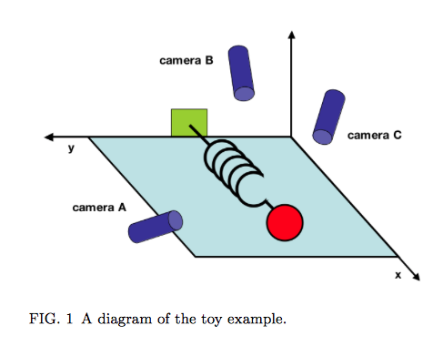
    In addition to exploring the assumptions and procedures involved in PCA, Shlens offers a suggestive concrete frame or “toy example” for thinking about it. PCA can be helpful if you want to identify underlying dynamics that have been both captured and obscured by initial measurements of a system. He stages a physical analogy, proposing the made-up situation in which the true axis of movement of a spring must be inferred from haphazardly positioned cameras A, B and C. (That movement is along the X axis.)

    Screen Shot 2015-07-02 at 6.50.53 AM

    Shlens notes that “we often do not know which measurements best reflect the dynamics of our system in question. Furthermore, we sometimes record more dimensions than we actually need!” The idea that the axis of greatest variance is also the axis that captures the “underlying dynamics” of the system is an important one, particularly in a situation where measurements are correlated. This condition is called multicollinearity. We encounter it in text analysis all the time.

    If one is willing to entertain the thought that (a) language behaves like a spring across a series of documents and (b) that LATs are like cameras that only imperfectly capture those underlying linguistic “movements,” then PCA makes sense as a tool for dimension reduction. Shlens makes this point very clearly on page 7, where he notes that PCA works where it works because “large variances have important dynamics.” We need to spend more time thinking about what this linkage of variances and dynamics means when we’re talking about features of texts. We also need to think more about what it means to treat individual documents as observations within a larger system whose dynamics they are assumed to express.

    Getting to the Projections

    How might we go about picturing this mathematical process of orthogonal projection? Shlens’s tutorial focuses on matrix manipulation, which means that it does not help us visualize how the transformation matrix P assists in the projection of the original matrix onto the new bases. But we want to arrive at a more geometrically explicit, and so perhaps intuitive, way of understanding the procedure. So let’s use the code I’ve provided for this post to look at the same data we started with. These are the mean-subtracted values of the Docuscope LATs AbstractConcepts and FirstPerson in the Folger Editions of Shakespare’s plays. Screen Shot 2015-06-22 at 9.43.18 PMTo get started, you must place the .csv file containing the data above into your R working directory, a directory you can change using the the Misc. tab. Paste the entire text of the code in the R prompt window and press enter.  Within that window, you will now see several means of calculating the covariance matrix (S) from the initial matrix (X) and then deriving eigenvectors (P) and final scores (Y) using both the automated R functions and “longhand” matrix multiplication. If you’re checking, the results here match those derived from the manual operations documented the Excel spreadsheet, albeit with an occasional sign change in P.  In the Quartz graphic device (a separate window), we will find five different images corresponding to five different views of this data. You can step through these images by keying control-arrow at the same time.
    The first view is a centered scatterplot of the measurements above on our received or “naive bases,” which are our two docuscope LATs. These initial axes already give us important information about distances between texts. I repeat the biplot from the top of the post, which shows that according to these bases, Macbeth is the second “closest” play to Henry V (sitting down and to the right of Troilus and Cressida, which is first):

    Screen Shot 2015-06-22 at 10.01.43 PM

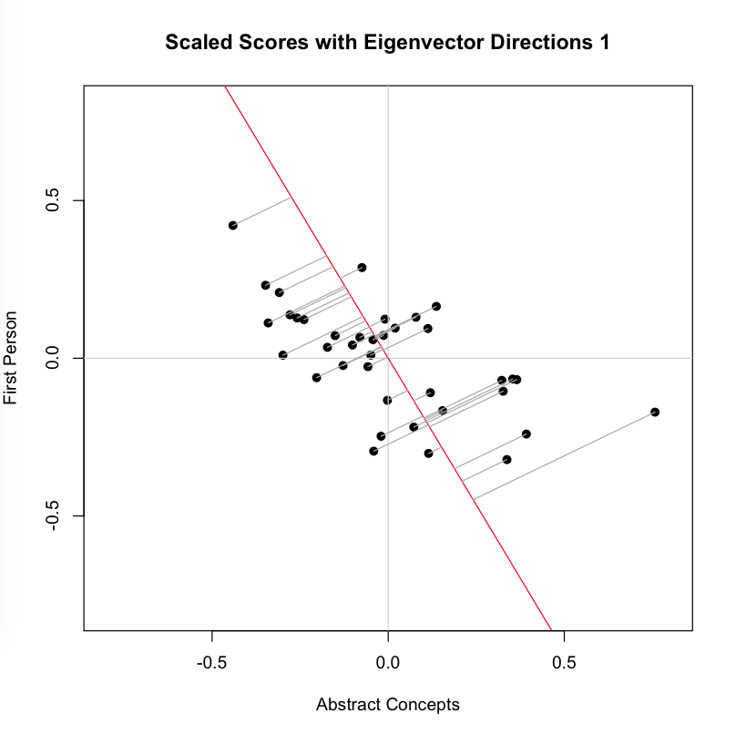
    Now we look at the second image, which adds to the plot above a line that is the eigenvector corresponding to the highest eigenvalue for the covariance matrix S. This is the line that, by definition, maximizes the variance in our two dimensional data:Screen Shot 2015-07-02 at 10.52.32 PMYou can see that each point is projected orthogonally on to this new line, which will become the new basis or first principal component once the rotation has occurred. This maximum is calculated by summing the squared distances of each the perpendicular intersection point (where gray meets red) from the mean value at the center of the graph. This red line is like the single camera that would “replace,” as it were, the haphazardly placed cameras in Shlens’s toy example. If we agree with the assumptions made by PCA, we infer that this axis represents the main dynamic in the system, a key “angle” from which we can view that dynamic at work. 
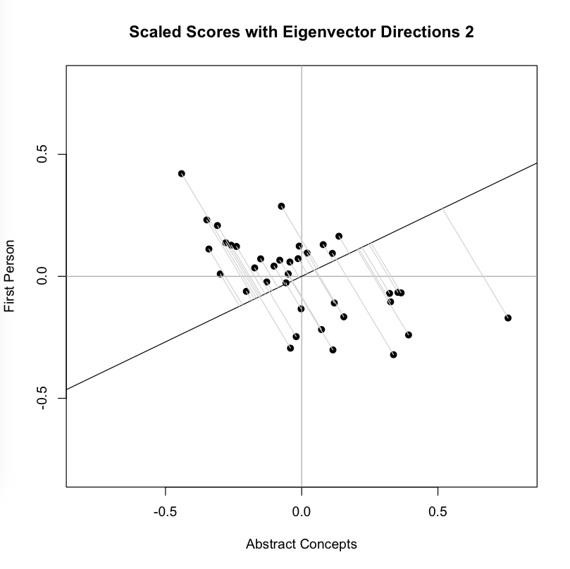
    The orthonormal assumption makes it easy to plot the next line (black), which is the eigenvector corresponding to our second, lesser eigenvalue. The measured distances along this axis (where gray meets black) represents scores on the second basis or principal component, which by design eliminates correlation with the first. You might think of the variance along this line is the uncorrelated “leftover” from the that which was captured along the first new axis. As you can see, intersection points cluster more closely around the mean point in the center of this line than they did around the first:
    Screen Shot 2015-07-02 at 11.09.16 PMNow we perform the change of basis, multiplying the initial matrix X by the transformation matrix P. This projection (using the gray guide lines above) onto the new axis is a rotation of the original data around the origin. For the sake of explication, I highlight the resulting projection along the first component in red, the axis that (as we remember) accounts for the largest amount of variance:
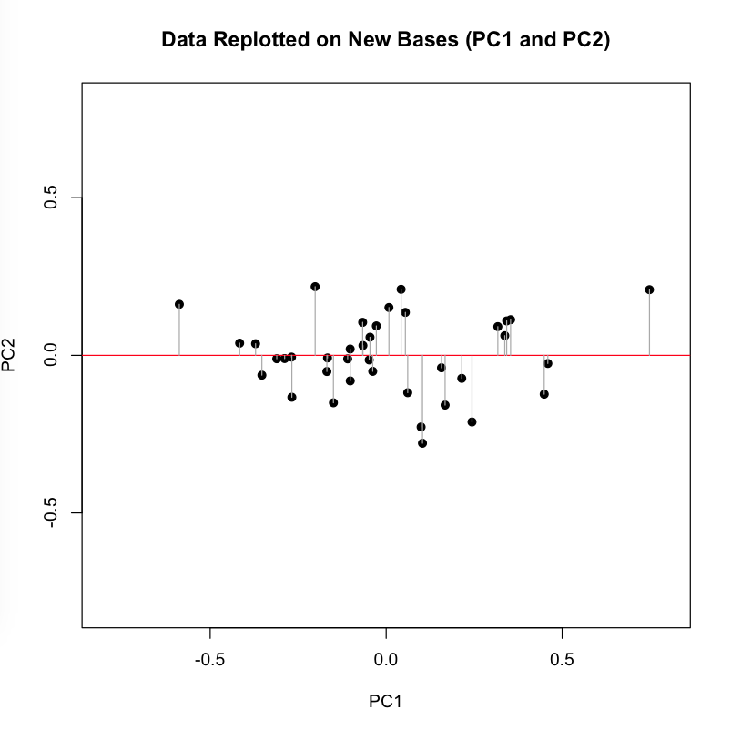
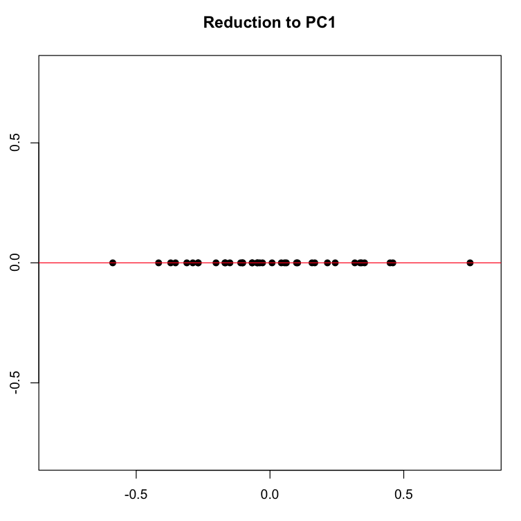
    Screen Shot 2015-07-02 at 11.18.41 PMIf we now force all of our dots onto the red line along their perpendicular gray pathways, we eliminate the second dimension (Y axis, or PC2), projecting the data onto a single line, which is the new basis represented by the first principal component.

    Screen Shot 2015-07-02 at 11.44.42 PM

    We can now create a list of the plays ranked, in descending order, on this first and most principal component. This list of distances represents the reduction of the two initial dimensions to a single one, a reduction motivated by our desire to capture the most variance in a single direction.

    How does this projection change the distances among our items? The comparison below shows the measurements, in rank order, of the far ends of our initial two variables (AbstractConcepts and FirstPerson) and of our new variable (PC1). You can see that the plays have been re-ordered and the distances between them changed:

    Screen Shot 2015-07-03 at 12.14.04 AM

    Our new basis, PC1, looks like it is capturing some dynamic that we might connect to the what the creators of the First Folio (1623) labeled as “comedy.” When we look at similar ranked lists for our initial two variables, we see that individually they too seemed to be connected with “comedy,” in the sense that a relative lack of one (AbstractConcepts) and an abundance of the other (FirstPerson) both seem to contribute to a play’s being labelled a comedy. Recall that these two variables showed a negative covariance in the initial analysis, so this finding is unsurprising.

    But what PCA has done is combined these two variables into a new one, which is a linear combination of the scores according to weighted coefficients (found in the first eigenvector). If you are low on this new variable, you are likely to be a comedy. We might want to come up with a name for PC1, which represents the combined, re-weighted power of the first two variables. If we call it the “anti-comedy” axis — you can’t be comic if you have a lot of it! — then we’d be aligning the sorting power of this new projection with what literary critics and theorists call “genre.” Remember that by aligning these two things is not the same as saying one is the cause of the other.

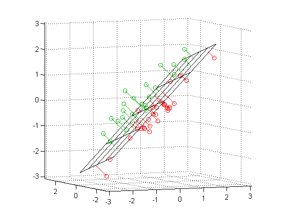
    With a sufficient sample size, this procedure for reducing dimensions could be performed on a dozen measurements or variables, transforming that naive set of bases into principal components that (a) maximize the variance in the data and, one hopes, (b) call attention to the dynamics expressed in texts conceived as “system.” If  you see PCA performed on three variables rather than two, you should imagine the variance-maximizing-projection above repeated with a plane in the three dimensional space:

    orthoregdemo_02

    Add yet another dimension, and you can still find the “hyperplane” which will maximize the variance along a new basis in that multidimensional space. But you will not be able to imagine it.

    Because principal components are mathematical artifacts — no one begins by measuring an imaginary combination of variables — they must be interpreted. In this admittedly contrived example from Shakespeare, the imaginary projection of our existing data onto the first principal component, PC1, happens to connect meaningfully with one of the sources of variation we already look for in cultural systems: genre. A corpus of many more plays, covering a longer period of time and more authors, could become the basis for still more projections that would call attention to other dynamics we want to study, for example, authorship, period style, social coterie or inter-company theatrical rivalry.

    I end by emphasizing the interpretability of principal components because we humanists may be tempted to see them as something other than mathematical artifacts, which is to say, something other than principled creations of the imagination. Given the data and the goal of maximizing variance through projection, many people could come up with the same results that I have produced here. But there will always be a question about what to call the “underlying dynamic” a given principal component is supposed to capture, or even about whether a component corresponds to something meaningful in the data. The ongoing work of interpretation, beginning with the task of naming what a principal component is capturing, is not going to disappear just because we have learned to work with mathematical — as opposed to literary critical — tools and terms.

    Axes, Critical Terms, and Motivated Fictions

    Let us return to the idea that a mathematical change of basis might call our attention to an underlying dynamic in a “system” of texts. If, per Shlens’s analogy, PCA works by finding the ideal angle from which to view the oscillations of the spring, it does so by finding a better proxy for the underlying phenomenon. PCA doesn’t give you the spring, it gives you a better angle from which to view the spring. There is nothing about the spring analogy or about PCA that contradicts the possibility that the system being analyzed could be much more complicated — could contain many more dynamics. Indeed, there nothing to stop a dimension reduction technique like PCA from finding dynamics that we will never be able to observe or name.

    Part of what the humanities do is cultivate empathy and a lively situational imagination, encouraging us to ask, “What would it be like to be this kind of person in this kind of situation?” That’s often how we find our way into plays, how we discover “where the system’s energy is.” But the humanities is also a field of inquiry. The enterprise advances every time someone refines one of our explanatory concepts and critical terms, terms such as “genre,” “period,” “style,” “reception,” or “mode of production.”

    We might think of these critical terms as the humanities equivalent of a mathematical basis on which multidimensional data are projected. Saying that Shakespeare wrote “tragedies” reorients the data and projects a host of small observations on a new “axis,” as it were, an axis that somehow summarizes and so clarifies a much more complex set of comparisons and variances than we could ever state economically. Like geometric axes, critical terms such as “tragedy” bind observations and offer new ways of assessing similarity and difference. They also force us to leave things behind.

    The analogy between a mathematical change of basis and the application of critical terms might even help explain what we do to our colleagues in the natural and data sciences. Like someone using a transformation matrix to re-project data, the humanist introduces powerful critical terms in order to shift observation, drawing some of the things we study closer together while pushing others further apart. Such a transformation or change of basis can be accomplished in natural language with the aid of field-structuring analogies or critical examples. Think of the perspective opened up by Clifford Geertz’s notion of “deep play,” or his example of the Balinese cock fight, for example. We are also adept at making comparisons that turn examples into the bases of new critical taxonomies. Consider how the following sentence reorients a humanist problem space: “Hamlet refines certain tragic elements in The Spanish Tragedy and thus becomes a representative example of the genre.”

    For centuries, humanists have done these things without the aid of linear algebra, even if matrix multiplication and orthogonal projection now produce parallel results. In each case, the researcher seeks to replace what Shlens calls a “naive basis” with a motivated one, a projection that maps distances in a new and powerful way.

    Consider, as a final case study in projection, the famous speech of Shakespeare’s Jacques, who begins his Seven Ages of Man speech with the following orienting move: “All the world’s a stage, / And all the men and women merely players.” With this analogy, Jacques calls attention to a key dynamic of the social system that makes Shakespeare’s profession possible — the fact of pervasive play. Once he has provided that frame, the ordered list of life roles falls neatly into place.

    This ability to frame an analogy or find an orienting concept —the world is a stage, comedy is a pastoral retreat, tragedy is a fall from a great height, nature is a book — is something fundamental to humanities thinking, yet it is necessary for all kinds of inquiry. Improvising on a theme from Giambattista Vico, the intellectual historian Hans Blumenberg made this point in his work on foundational analogies that inspire conceptual systems, for example the Stoic theater of the universe or the serene Lucretian spectator looking out on a disaster at sea. In a number of powerful studies — Shipwreck with SpectatorParadigms for a Metaphorology, Care Crosses the River — Blumenberg shows how analogies such as these come to define entire intellectual systems; they even open those systems to sudden reorientation.

    We certainly need to think more about why mathematics might allow us to appreciate unseen dynamics in social systems, and how critical terms in the humanities allow us to communicate more deliberately about our experiences. How startling that two very different kinds of fiction — a formal conceit of calculation and the enabling, partial slant of analogy — help us find our way among the things we study. Perhaps this should not be surprising. As artifacts, texts and other cultural forms are staggeringly complex.

    I am confident that humanists will continue to seek alternative views on the complexity of what we study. I am equally confident that our encounters with that complexity will remain partial. By nature, analogies and computational artifacts obscure some things in order to reveal other things: the motivation of each is expressed in such tradeoffs. And if there is no unmotivated view on the data, the true dynamics of the cultural systems we study will always withdraw, somewhat, from the lamplight of our descriptive fictions.
     

  • Finding “Distances” Between Shakespeare’s Plays 1

    swallows-300x199In honor of the latest meeting of our NEH sponsored Folger workshop, Early Modern Digital Agendas, I wanted to start a series of posts about how we find “distances” between texts in quantitative terms, and about what those distances might mean. Why would I argue that two texts are “closer” to one another than they are to a third that lies somewhere else? How do those distances shift when they are measured on different variables? When represented as points in different dataspaces, the distances between texts can shift as variables change — like a murmuration of starlings. So what kind of cloud is a cloud of texts?

    This first post begins with some work on the Folger Digital Texts of Shakespeare’s plays, which I’m making available in “stripped” form here. These texts were created by Mike Poston, who developed the encoding scheme for Folger Digital Texts, and who understands well the complexities involved in differentiating between the various encoded elements of a play text.

    I’ve said the texts are “stripped.” What does that mean? It means that we have eliminated those words in the Folger Editions that are not spoken by characters. Speech prefixes, paratextual matter, and stage directions are absent from this corpus of Shakespeare plays. There are interesting and important reasons why these portions of the Editions are being set aside in the analyses that follow, and I may comment on that issue at a later date. (In some cases, stripping will even change the “distances” between texts!) For now, though, I want to run through a sequence of analyses using a corpus and tools that are available to as many people as possible. In this case that means text files, a web utility, and in subsequent posts on “dimension reduction,” an excel spreadsheet alongside some code written for the statistics program R.

    The topic of this post, however, is “distance” — a term well worth thinking about as our work moves from corpus curation through the “tagging” of the text and on into analysis. As always, the goal of this work is to do the analysis and then return to these texts with a deepened sense of how they achieve their effects — rhetorically, linguistically, and by engaging aesthetic conventions. It will take more than one post to accomplish this full cycle.

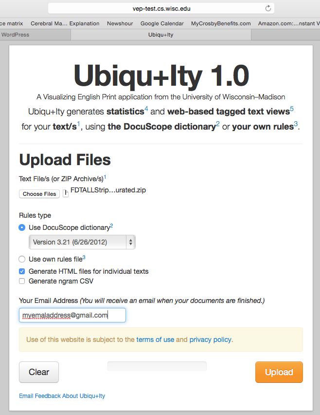
    So, we take the zipped corpus of stripped Folger Edition plays and upload it to the online text tagger, Ubiqu+ity. This tagger was created with support from the Mellon Foundation’s Visualizing English Print grant at the University of Wisconsin, in collaboration with the creators of the text tagging program Docuscope at Carnegie Mellon University. Uniqu+ity will pass a version of Docuscope over the plays, returning a spreadsheet with percentage scores on the different categories or Language Action Types (LATs) that Docuscope can tally. In this case, we upload the stripped texts and request that they be tagged with the earliest version of Docuscope available on the site, version 3.21 from 2012. (This is the version that Hope and I have used for most of our analyses in our published work. There may be some divergences in actual counts, as this is a new implementation of Docuscope for public use. But so far the results seem consistent with our past findings.) We have asked Ubiqu+ity to create a downloadable .csv file with the Docuscope counts, as well as a series of HTML files (see the checked box below) that will allow us to inspect the tagged items in textual form.


    Screen Shot 2015-06-22 at 9.02.58 PM

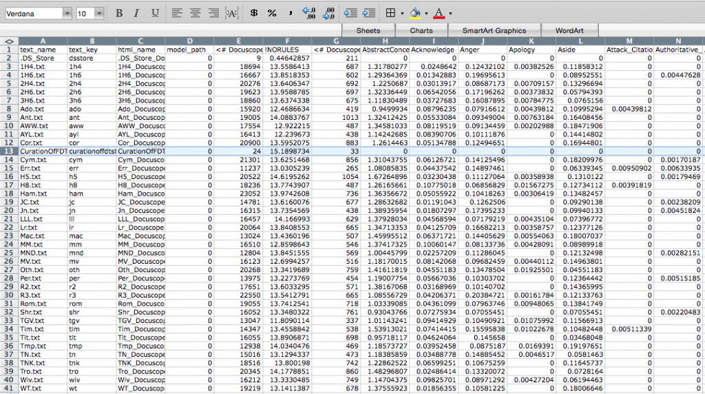
    The results can be downloaded here, where you will find a zipped folder containing the .csv file with the Docuscope counts and the HTML files for all the stripped Folger plays. The .csv file will look like the one below, with abbreviated play names arrayed vertically in the first column, then (moving columnwise to the right) various other pieces of metadata (text_key, html_name, and model_path), and finally the Docuscope counts, labelled by LAT. You will also find that a note on curation was fed into the program. I will want to remove this row when doing the analysis.

    Screen Shot 2015-06-23 at 8.35.34 AM

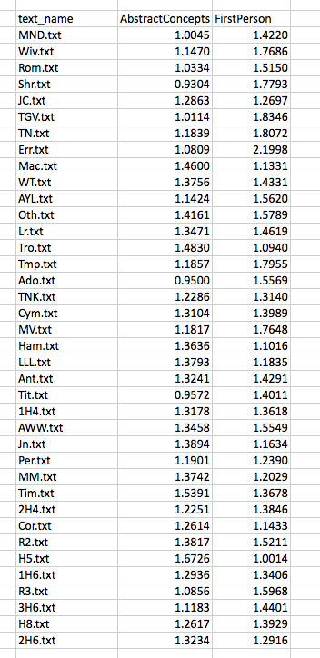
    For ease of explication, I’m going to pare down these columns to three: the name of the text in column 1, and then the scores that sit further to the right on the spreadsheet for two LATs: AbstractConcepts and FirstPerson. These scores are expressed as a proportion, which to say, the number of all tokens tagged under this LAT as a fraction of all the included tokens. So now we are looking at something like this:

    Screen Shot 2015-06-22 at 9.20.00 PM

    Before doing any analysis,  I will make one further alteration, subtracting the mean value for each column (the “average” score for the LAT) from every score in that column. I do this in order to center the data around the zero point of both axes:

    Screen Shot 2015-06-22 at 9.43.18 PMNow some analysis. Having identified a corpus (Shakespeare’s plays) and curated our texts (stripping, processing), we have counted some agreed upon features (Docuscope LATs). The features upon which we are basing the analysis are those words or strings of words that Docuscope counts as AbstractConcepts and FirstPerson tokens.

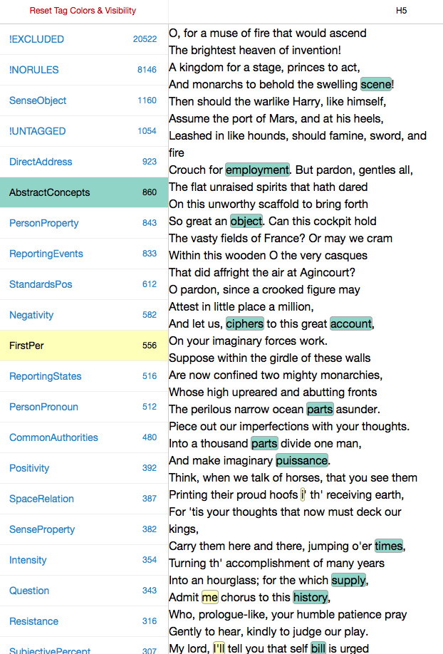
    It’s important to note that at any point in this process, we could have made different choices, and that these choices would have lead to different results. The choice of what to count is a vitally important one, so we ought to give thought to what Douscope counted as FirstPerson and AbstractConcepts. To get to know these LATs better — to understand what exactly has been assigned these two tags —we can open one of the HTML files of the plays and “select” that category on the right hand side of the page, scrolling through the document to see what was tagged. Below is the opening scene of Henry V, so tagged:

    Screen Shot 2015-06-23 at 8.28.10 AM


    Before doing the analysis, we will want explore the features we have been counting by opening up different play files and turning different LATs “on and off” on the left hand side of the HTML page. This is how we get to know what is being counted in the columns of the .csv file.

    I look, then, at some of our texts and the features that Ubiqu+ity tagged within them. I will be more or less unsatisfied with some of these choices, of course. (Look at “i’ th’ receiving earth”!)Because words are tagged according to inflexible rules, I will disagree with some of the things that are being included in the different categories. That’s life. Perhaps there’s some consolation in the fact that the choices I disagree with are, in the case of Docuscope, (a) relatively infrequent and (b) implemented consistently across all of the texts (wrong in the same way across all types of document). If I really disagree, I have the option of creating my own text tagger. In practice, Hope and I have found that it is easier to continue to use Docuscope, since we do not want to build into the tagging scheme the self-evident things we may be interested in. It’s a good thing that Docuscope remains a little bit alien to us, and to everyone else who uses it.

    Now to the question of distance.

    Screen Shot 2015-06-22 at 10.01.43 PM
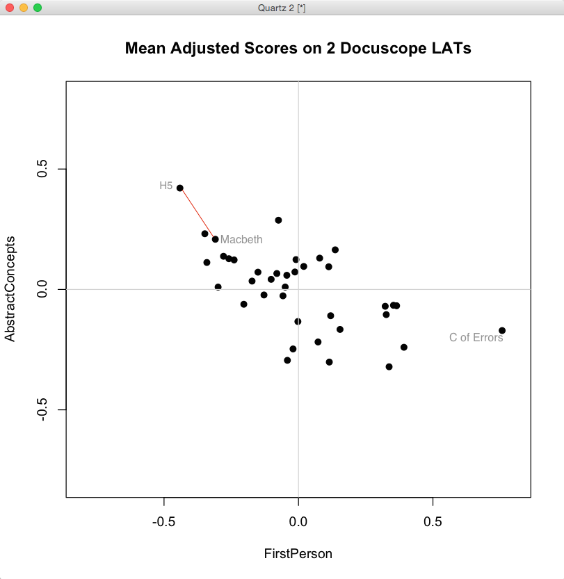
    When we look at the biplot above, generated in R from the mean-adjusted data above, we notice a general shape to the data. We could use statistics to describe the trend — there is a negative covariance between FirstPerson and AbstractConcept LATs — but we can already see that as FirstPerson tokens increase, the proportion of AbstractConcept tokens tends to decrease. The trend is a rough one, but there is the suggestion of a diagonal line running from the upper left hand side of the graph toward the lower right.

    What does “distance” mean in this space? It depends on a few things. First, it depends on how the data is centered. Here we have centered the data by subtracting the column means from each entry. Our choice of a scale on either axis will also affect apparent distances, as will our choice of the units represented on the axes. (One can tick off standard deviations around the mean, for example, rather than the original units, which we have not done). These contingencies point up an important fact: distance is only meaningful because the space is itself meaningful — because we can give a precise account of what it means to move an item up or down either of these two axes.

    Just as important: distances in this space are a caricature of the linguistic complexity of these plays. We have strategically reduced that complexity in order to simplify a set of comparisons. Under these constraints, it is meaningful to say that Henry V is “closer” to Macbeth than it is to Comedy of Errors. In the image above, you can compare these distances between the labelled texts. The first two plays, connected by the red line, are “closer” given the definitions of what is being measured and how those measured differences are represented in a visual field.

    When we plot the data in a two dimensional biplot, we can “see” closeness according to these two dimensions. But if you recall the initial .csv file returned by Ubiq+ity, you know that there can be many more columns — and so, many more dimensions — that can be used to plot distances.

    Screen Shot 2015-06-23 at 8.56.23 AM

    What if we had scattered all 38 of our points (our plays) in a space that had more than the two dimensions shown in the biplot above? We could have done so in three dimensions — plotting three columns instead of two — but once we arrive at four dimensions we are beyond the capacity for simple visualization.  Yet there may be a similar co-paterning (covariance) among LATs in these higher dimensional spaces, analogous to the ones we can “see” in two dimensions. What if , for example,the frequency of Anger decreases alongside that of AbstractConcepts just when FirstPerson instances increase? How should we understand the meaning of comparatives such as “closer together” and “further apart” in such multidimensional spaces? For that, we need techniques of dimension reduction.

    In the next post, I will describe my own attempts to understand a common technique for dimension reduction known as Principal Component Analysis. It took about two years for me to figure that out, however imperfectly. I wanted to pass that along in case others are curious. But it is important to understand that these more complex techniques are just extensions of something we can imagine in more simpler terms. And it is important to remember that there are very simple ways of visualizing distance — for example, an ordered list. We assessed distance visually in the biplot above, a distance that was measured according to two variables or dimensions. But we could have just as easily used only one dimension, say, Abstract Concepts. Here is the list of Shakespeare’s plays, in descending order, with respect to scores on AbstractConcepts:

    Screen Shot 2015-06-23 at 9.04.56 AM

    Even if we use only one dimension here, we can see once again that Henry V is “closer” to Macbeth than it is to Comedy of Errors. We could even remove the scores and simply use an ordinal sequence of this play, then this, then this. There would still be information about “distances” in this very simple, one dimensional, representation of the data.

    Now we ask ourselves: which way of representing the distances between these tests is better? Well, it depends on what you are trying to understand, since distances — whether in one, two, or many more dimensions — are only distances according to the variables or features (LATs) that have been measured. In the next post, I’ll try to explain how the thinking above helped me understand what is happening in a more complicated form of dimension reduction called Principal Component Analysis. I’ll use the same mean adjusted data for FirstPerson and AbstractConcepts discussed here, providing the R code and spreadsheets so that others can follow along. The starting point for my understanding of PCA is an excellent tutorial by Jonathon Shlens, which will be the underlying basis for the discussion.


  • Now Read This: A Thought Experiment

    MRILet’s say that we believe we can learn something more about what literary critics call “authorial style” or “genre” by quantitative work. We want to say what that “more” is. We assemble a community of experts, convening a panel of early modernists to identify 10 plays that they feel are comedies based on prevailing definitions (they end in marriage), and 10 they feel are tragedies (a high born hero falls hard). To test these classifications, we randomly ask others in the profession (who were not on the panel) to sort these 20 plays into comedies and tragedies and see how far they diverge from the classifications of our initial panel. That subsequent sorting matches the first one, so we start to treat these labels (comedy/tragedy) as “ground truths” generated by “domain experts.” Now assume that I take a computer program, it doesn’t matter what that program is, and ask for it to count things in these plays and come up with a “recipe” for each genre as identified by our experts. The computer is able to do so, and the recipes make sense to us. (Trivially: comedies are filled with words about love, for example, while tragedies use more words that indicate pain or suffering.) A further twist: because we have an unlimited, thought-experiment budget, we decide to put dozens of early modernists into MRI machines and measure the activity in their brains while they are reading any of these 20 plays. After studying the brain activity of these machine-bound early modernists, we realize that there is a distinctive pattern of brain activity that corresponds with what our domain experts have called “comedies” and “tragedies.” When someone reads a comedy, regions A, B and C become active, whereas when a person reads tragedies, regions C, D, E, and F become active. These patterns are reliably different and track exactly the generic differences between plays that our subjects are reading in the MRI machine.

    So now we have three different ways of identifying – or rather, describing – our genre. The first is by expert report: I ask someone to read a play and she says, “This is a comedy.” If asked why, she can give a range of answers, perhaps connected to plot, perhaps to her feelings while reading the play, or even to a memory: “I learned to call this and other plays like it ‘comedies’ in graduate school.” The second is a description, not necessarily competing, in terms of linguistic patterns: “This play and others like it use the conjunction ‘if’ and ‘but’ comparatively more frequently than others in the pool, while using ‘and’ less frequently.” The last description is biological: “This play and others like it produce brain activity in the following regions and not in others.” In our perfect thought experiment, we now have three ways of “getting at genre.” They seem to be parallel descriptions, and if they are functionally equivalent, any one of them might just be treated as a “picture” of the other two. What is a brain scan of an early modernist reading comedy? It is a picture of the speech act: “The play I’m reading right now is a comedy.”

    Now the question. The first three acts of a heretofore unknown early modern play are discovered in a Folger manuscript, and we want to say what kind of play it is. We have our choice of either:

    • asking an early modernist to read it and make his or her declaration

    • running a computer program over it and rating it on our comedy/tragedy classifiers

    • having an early modernist read it in an MRI machine and characterizing the play on the basis of brain activity.

    Let’s say, for the sake of argument, that you can only pick one of these approaches. Which one would you pick, and why? If this is a good thought experiment, the “why” part should be challenging.

  • The Novel and Moral Philosophy 3: What Does Lennox Do with Moral Philosophy Words?

    The previous two posts explored how an eighteenth century novel uses words from an associated topic to fulfill, and perhaps shape, the expectations of an audience looking to immerse themselves in a life as it is lived. In this post I want to think a little more about the idea that the red words identified by Serendip’s topic model do something exclusively “novel-like” and that the blue words are exclusively “philosophical.” Both sets of words seem, rather, to aim at a common target, since each contributes something distinctive to the common project of rendering a moral perspective on lived experience. I want to caution against thinking of these topics as “signatures” of different genres; they may instead index narrative strategies that criss-cross different types of writing.

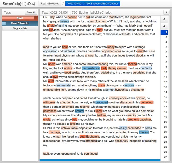
    Take, for example, the passage from Lennox’s Euphemia that appears toward the bottom of the screen shot below:

    SnipImage8

    After relating several details about her relationship with her aunt and uncle, Maria concludes: “BEING in this unfavourable disposition towards me, he [Sir John] was easily persuaded to press me to a marriage, in which my in|clinations were much less consulted than my interests.” This sentence illustrates some of the dynamics that Park described in her earlier post. On the one hand, Maria’s letter immerses the reader in a scene from life, rendering vivid the circumstances that led her uncle to make a fateful decision about Maria’s marriage prospects. Yet at the same time, the narrator dips frequently into the vocabulary of a more removed and somewhat static moral judgment – one that appraises “circumstance” in relation to “actions” and “interest.” The red words, novelistic in our analysis, are the words that show us how something happened: Maria’s uncle Sir John decided to force her into “marriage,” ignoring his niece’s wishes or inclinations because he was in an “unfavourable” disposition that made him more easily “persuaded” to this course of action. (We are getting contextual details – backstory – that make his decision intelligible.) These red, novelistic topic words – marriage, persuaded, unfavorable – are thus necessary for rendering the sequence of events that prompted her change of fortunes. A man was persuaded, his favor had changed, and a marriage ensued.

    But the narrative sequence opens up onto a more general possibility for analysis. An abstract noun – “interest” – is offered as the nominal criterion for her uncle’s decision, but in the context of the sentence it seems to gloss the uncle’s reasoning as he might represent it to Maria (“this marriage is in your interest”), not the narrator’s feelings about that reasoning (“it was in my interest”). What we are getting, then, is the narrator’s view of how her uncle made his decision, what circumstances contributed to his thinking, even the abstract concept that he could have invoked in the absence of any residual “natural” sympathy for his niece’s inclinations. One sees, perhaps, a tension between the kinds of abstract nouns that appear in works of moral philosophy – in the screen shot above, “natural” “actions” “circumstance” “interest” – and the concrete terms of relation that render action for us in a more vivid, immediate way.

    What is interesting about this passage is that it shows us how flexible the abstract vocabulary of moral philosophy can be when it is introduced into the narrative stream of a novel. In the passage above, Maria tells us that her aunt, Lady Harley, was stung by jealousy when she witnessed Sir John’s pleasure at hearing his niece read. Out of spite, the aunt insinuates that there is a contradiction between the “oppression and faintness” that Maria purportedly has complained of and her manifestly good spirits, which Sir John would otherwise take on face value. Maria then uses the abstract noun “circumstance” to characterize the fact of her good spirits, a fact which Sir John is now (culpably) discounting.

    The shift in register becomes necessary because Sir John has abandoned his natural sympathy for Maria and is instead bringing a quasi-judicial process of weighing her actions (thinking “circumstantially”). It’s the intermixture of these fragments of moral reasoning with images of life as it unfolds – a didactic mix of abstract nouns and personal actions – that are allowing Lennox to stage distinct layers of sympathy and indifference, serving them all up for the reader’s observation. The shift to moral evaluation is even more decisive in the following passage from letter V, in which Maria tells Euphemia how Sir James came to doubt her aunt’s deprecations and once again view his niece in a favorable light:

    SnipImage12Maria is moving into the realm of generalization (“I have often observed…”), and this shift requires the writer to “investigate” the ways in which Sir James was led to “compare” Maria’s behavior with a secondhand “picture” that has been drawn of her “disposition” by her aunt. These blue words might be seen as pivots in a process of moral judgment – the same process that the novel’s reader had to employ in evaluating Sir James’ earlier souring on his niece. Because this process itself is now the subject of narration, it is not surprising that the vocabulary needs to be more structured and abstract.

    In using Serendip to explore how Euphemia behaves linguistically qua novel, then, we must start with the idea that novels mix the vocabularies of these two topics in order to layer points of view and to involve the reader, experientially, in a world where actions have moral significance. Moral philosophy words (blue) are important because they mark occasions where that state of experiential immersion has been temporarily deflected onto some explicitly moralizing, explicitly generalizing consciousness, a consciousness which may or may not be that of the narrator. Regardless of its origin, the capacity of that consciousness to withdraw temporarily from the particulars of the narrative and to render judgment on a kind of act seems a crucial aspect of the novel’s program, which Julie Park described in her previous post in terms of the novel’s epistolarity and emphasis on sensibility.

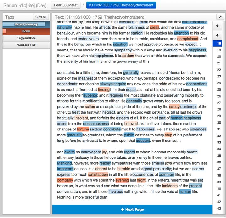
    We can say, moreover, that this procedure of mixing words from these two topics also occurs in formal works of moral philosophy. Consider the passage from Smith’s Theory of Moral Sentiments below:

    SnipImage13

    In this passage, Smith is describing the way in which a man – any man whatever – will alter his treatment of his friends if suddenly elevated in social status. Such a man becomes insolent and petulant, which is why Smith believes that one should slow one’s social rise whenever possible. “He is happiest,” Smith writes, “who advances more gradually to greatness, whom the public destines to every step of his preferment long before he arrives at it…” Smith is encouraging his audience to pass judgment on a drama whose characters are never rendered concrete, characters whose actions illustrate a concept. The closest Smith gets to a novelistic treatment of the life world occurs just after he has presented his maxim above. Instead of calculating and re-calculating one’s standing among friends, Smith writes, one should find “satisfaction in all the little occurrences of common life, in the company with which we spent the evening last night.” Smith modulates into the red here, drawing words from the life world as if he himself is reporting on events in his own life just the night before, events which ground and so justify the moral pleasure he takes in them precisely because they are not bloodless and calculating. Smith has, for a sentence or two, become an epistolary novelist, and it is this sudden (and relatively rare) excursion into the every day – the world of “last night” – that allows him to show the difference between happiness and its opposite.

    As an excursion, this passage has to be brief. There is “a lot of blue” in moral philosophy because, as philosophy, it needs to be systematic – indifferent, in other words, to the most particular details of the life world. But the subject of this philosophy is certainly the stuff of novels: dramas of sympathy, judgments of circumstances and the precise analysis of the qualities and intentions suffusing different acts (including the quality of failing to be concrete in one’s observations). If the burden of system building were relaxed, Smith too might write volubly about the “satisfactions” one finds “in the little occurrences of common life.”

  • Adjacencies, Virtuous and Vicious, and the Forking Paths of Library Research

    Folger Secondary Stacks, western view
    Folger Secondary Stacks, western view

    Browsable stacks – shelves of books that you can actually look at, pull off the shelf, read a while, and put back. They’re wonderful. Folger readers regularly comment on the fact that they can walk freely through the stacks of the secondary collection, which in our case means books published after 1830. That collection is arranged by Library of Congress call number, and many know the system intuitively after years of library work. (I frequently find myself in the PRs and PNs.)

    Recently I was looking through section PN6420.T5 for books on early modern proverbs, a topic I have been writing about for years. I was looking for Morris Palmer Tilley’s collection, A Dictionary of Proverbs in England in the Sixteenth and Seventeenth Centuries (Michigan: University of Michigan Press, 1950). There it was, right where it was supposed to be: a landmark piece of scholarship that is the first source for anyone interested in the topic. Yet this was only the first stop. On the shelves above and below this important source were about 30 other books on the subject, some of which I began to explore. Some very useful books turned up next to the one I had initially intended to find. Some of them have even turned up in my footnotes, the ultimate test, perhaps, of a book’s usefulness to a scholar.

    Stack browsers are on the lookout for this kind of happy accident. You go into the stacks looking for this book, but another one, more interesting, happens to be nearby. Now you can have a look, nibble around the edges of the promising title, which is an excellent form of procrastination if you are stuck or unready to begin writing. Having done my share of meandering in open stacks, I am intrigued when readers describe these moments of discovery ­– which after all are part of the natural progression of research – as happy accidents or the products of chance. Aren’t accidents things that you cannot, by definition, bring about or encourage?

    The fact remains that libraries are set up to make such accidents happen. They arrange books on the shelves in a certain way – not at random, but on a plan designed to increase the likelihood that, nearby the book you think you want, there will be others you also want to read. When someone says, “and then I happened upon this great book,” they may be describing the advantages of the library’s structured arrangement of books by (say) subject matter. Partly an effect of a classification system, partly one of the physical arrangement of the space, Libraries are designed to promote “lucky finds.”

    Such “encouragable accidents” are really the consequence of a simple principle that governs the entire space of the library: that of structured adjacency. As I will try to show in a moment, this principle can be seen at work in both the physical spaces of the stacks and the digital discovery spaces designed to give us access to the collection. The root of the word adjacency is the Latin verb jacere, which means to throw. When books appear side by side on a library shelf, their adjacency is not a product of chance: they have been placed (hopefully not thrown) together so that one is next to another of similar kind. How might one structure such adjacencies? One technique would be to shelve books by size. In some medieval monasteries, books of a similar size were placed on the same shelf. In addition to saving shelf space (think about it), this arrangement located collection access in the mind of the librarian or keeper who knew where different titles were. These collections weren’t designed to be browsed, so the principle made sense.

    Now think of a modern, browsable stack of books arranged along the Library of Congress call number model. Here the principle of access exists in two places: the launching point of the card catalogue (which tells you where in the stacks to start looking) and then on the shelves themselves, where books on similar subjects are grouped together. The idea here is to use the intellectual scaffolding of subject cataloguing to structure the physical space of the collection. With respect to subject, physical adjacencies on the shelf become virtuous instead of vicious.

    What is a virtuous adjacency? It is a collocation of two items likely to appeal to any-user-whatever whose item search is itself structured along principles which the cataloguing supports: usually author, date, title, subject, although there are many other forms of search. It doesn’t matter who you are or how deep your knowledge of the subject is: if you know enough to find one book on proverbs, you can find many in the Library of Congress system, because you are helped along by the arrangement in the physical space of the library. That arrangement is principled and intentional. It is virtuous.

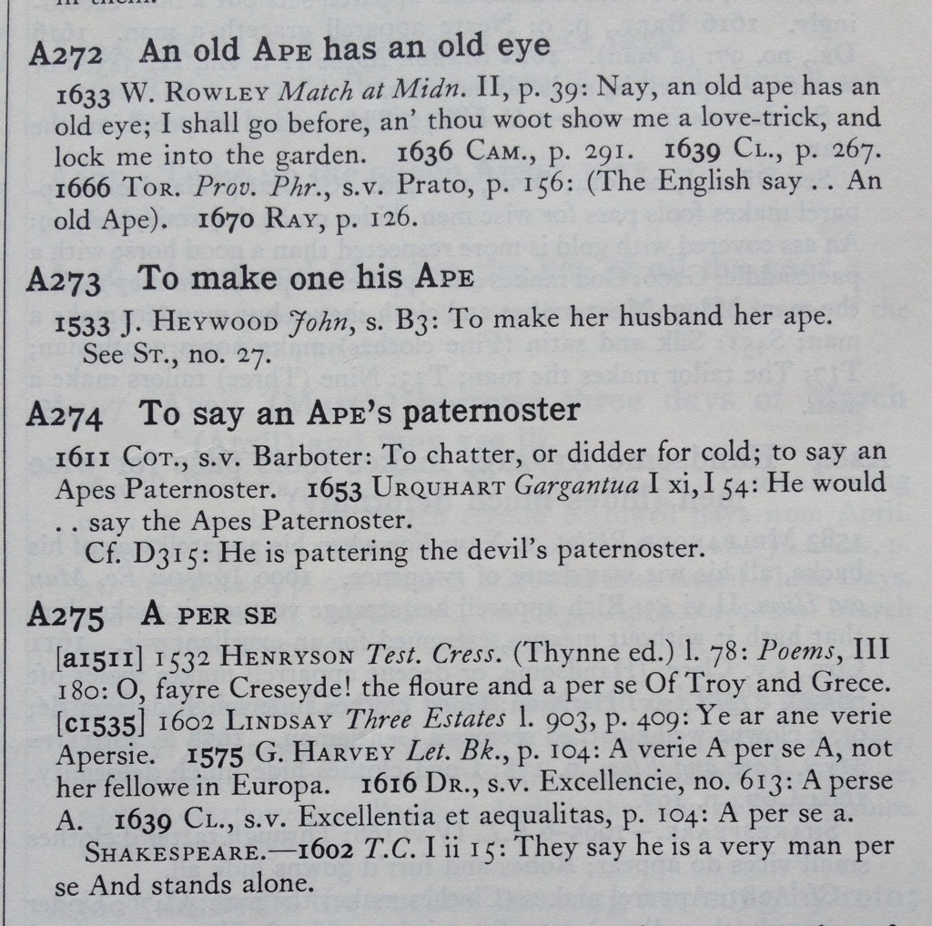
    But every virtuous adjacency can quickly become vicious, and this is because virtue (as I’m calling it) resides in the principles that inform any given reader’s search for a book. Suppose I know about Tilley’s book on proverbs, and I know it by title. Once I am pointed to that book by the catalogue, I go and look at it, and I see some terrific proverbs about apes, for example, “To make her husband her ape.”  I start to think about this. Maybe what I’m really interested in is how the behavior of apes helps people think about the nature of mimicry and mimesis in the early modern period. (Early modern references to apes are often veiled references to the mimetic power of artists, who “ape” nature.)

    Proverb from Tilley's A Dictionary of Proverbs in England
    Proverb from Tilley’s A Dictionary of Proverbs in England

    Now the principle that governs the space flips. What I need to do is go to H. W. Janson’s magnificent Apes and Ape Lore in the Middle Ages and Renaissance, which has the call number GR730.A6 J3. What made the first adjacency surrounding “books about proverbs” virtuous was the collocation of books in space by subject. That was where the manufactured serendipity happened. But now that very principle of adjacency has become an impediment – it has become vicious – because Tilley is not surrounded by books about apes. I could search again under the latter subject, but that would not be adjacency, it would be search. We advert to catalogues in order to re-orient ourselves within the physical universe of books-on-shelves, or the virtual space of digital collections. But we cannot simply wander into that next thing that meets our new interest. To do this, I really would have to be lucky: “Oh look, there’s Jansen’s book on apes, just lying across the aisle….”

    The moral of this story – or is it the proverb? – is that “every virtuous adjacency is also vicious.” When it comes to the arrangement of books, virtue is relative: it depends upon what the researcher thinks he or she is looking for, a thinking that often changes in the course of research. Once you’ve flipped from proverbs to apes, the physical arrangement of books on shelves is not going to help you. The virtuous arrangement that allowed you to lay your hands on that first book (“hey, my favorite book on proverbs!”) is now working against you (“shouldn’t I be looking at books about apes?”).

    As we gain greater access to the contents of books; as digitized books and their machine actionable contents become more and more arrangeable with the assistance of mathematical principles like the topic model, the physical space of search is being transformed into something more plastic, even Borgesian. While the physical space of the library cannot be re-plotted whenever the research forks out onto another garden path, researchers have more options in the virtual space of text searching to find cut-throughs. There is a problem here, of course, which is that in such a virtual world of association, there are infinite pathways for association. It becomes more challenging to figure out where to go next when you could go anywhere.

    But there may be other ways to multiply virtuous pairings given the tools that librarians of the future will create. Instead of starting with Tilly and then hoping that I’ll be lucky enough to bump into Jansen, I might rely on my mobile device to reach into the contents of the book I’m interested in now and, based on a principle of adjacency I supply, rearrange all the books in the library around that first book in concentric layers of immediacy of different types – layers that might allow readers to move from one virtuous adjacency to the next. There is no way around the virtuous/vicious symmetry, since it is precisely that symmetry which makes research necessary: in exploring the connection between these five books on proverbs, you are giving up the opportunity to think about that other, really, really good book about apes. (You can tell I wish I’d found Jansen earlier.) What makes an adjacency for one research task virtuous makes that adjacency vicious for the next.

    That’s why answers to research questions do not turn up instantly. You have to decide when to shift directions, and the physical layout of library stacks according to a single principle of adjacency (e.g., subject cataloguing) is going to sustain some inquiries while simultaneously shutting down others. No amount of dynamic text search is going to put an end to the virtuous/vicious circle: their pairing represents a real constraint on knowledge – the fact that thinking is progressive, and moves on discrete pathways – rather than a technological or physical limitation to be overcome.

    That is not to say that there aren’t new ways of mapping adjacencies among digitized texts. Abstract models of the contents of books such as topic models, however, do offer us other pathways in the research process; they are an additional principle of adjacency that we can invoke if we don’t want to “jump the hedge” by consulting a book’s footnotes (say) and then searching for new items based on the titles referenced there. (On topic models, see Ted Underwood’s very helpful blog post.) We have been using topic models in the Wisconsin VEP project to look at our collections of texts, and they do seem to open up adjacencies that we would never have thought about. (An upcoming blog post will deal with the relationship between the novel and English moral philosophy.) A topic model can suggest, for any given book or passage, another book or passage that might be relevant for reasons only a user could recognize (but might not be able spontaneously to supply). As with other techniques of dimension reduction (e.g., PCA, factor analysis), there may be more topics than we can name or recognize: a topic does not become a principle of association until a human being recognizes and affirms that principle in action.

    If libraries are gardens with many forking paths, the hedges that separate those paths are absolutely real. Even a fully virtual, instantly re-arrangeable virtual rendering of our shelf spaces will not put an end to vicious adjacencies, since they too will become virtuous if research takes a new turn.  Our challenge is not a physical one; it’s not even computational. In a future library where any two books could be placed alongside one another in an instant, we might never find anything we want to read.

    The task of library research is not simply that of poking around clusters of items on a shelf, or more grandly, finding ways of reclustering books continuously in hopes of finding the ultimate, virtuous arrangement. There is no Leibnizian, maximally virtuous arrangement of books, and never will be. (Leibniz must have hit upon this melancholy thought when he was librarian at Wolfenbuttel.)

    But there are more or less definite lines of thought, each on its way to becoming other, equally definite, lines of thought. There is no point in celebrating the fact that such lines can fork off in an infinite number of directions. We know already that a researcher can only follow one of them at a time.