Tag: Google

  • What Do People Read During a Revolution?

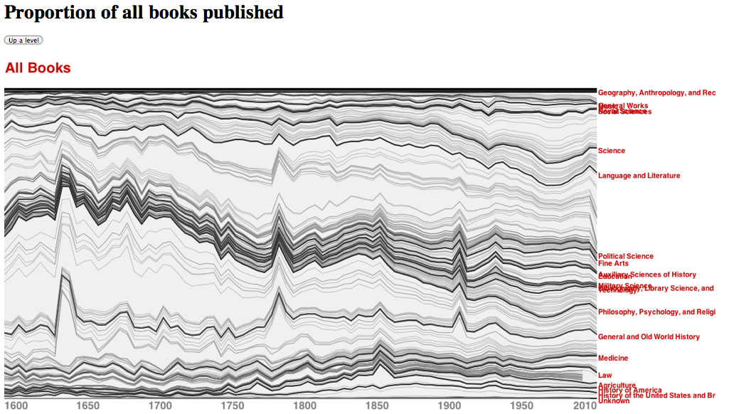
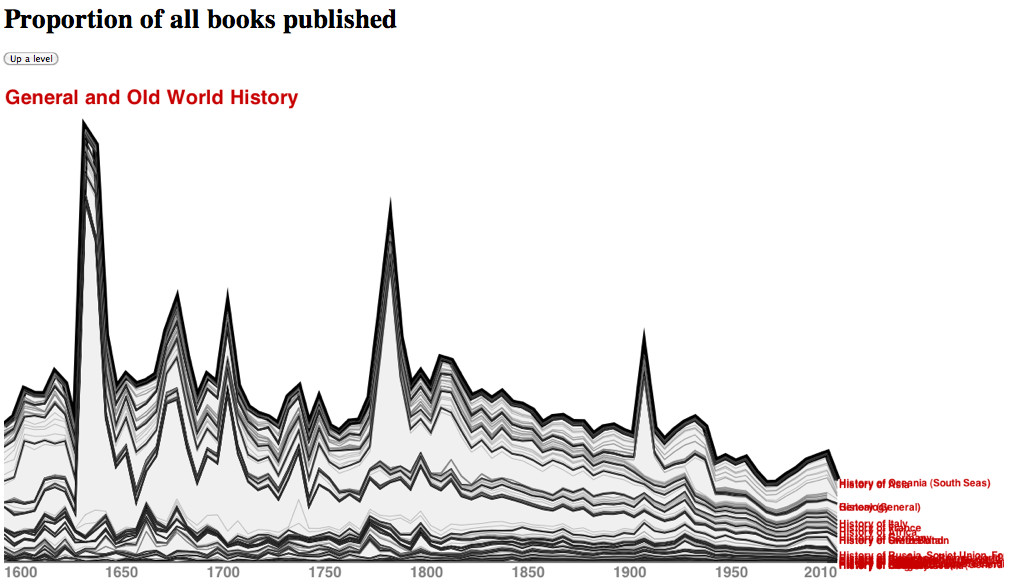
    These two visualizations spark two interesting questions: What do people read during a revolution?  What is the connection between what people read and political events? Both images spike dramatically around moments of upheaval in the Western World: The English, American, and French Revolutions, the mid-19th-century Europe-wide overthrow of governments, and World War I, to name just a few.  These images are all the more striking because they did not arise from a historical study of warfare or publishing, but from a more workaday task—that of categorizing all books from 1600 to 2010 according to Library of Congress subject headings. (The source of the data was Google’s catalog of books as of 2010.)  The visualizations were shown in passing during a 2010 meeting between researchers at Google, where the data had been produced, and a group of humanities scholars and advocates, who were meeting with the Google team to exchange ideas. When Google’s Jon Orwant flashed this image on the screen, the professors in the assembly gasped. Genuinely gasped. We could see in this visualization of data things that had been debated for centuries, but that had never been seen: a connection between the world of print and the world of political action, a link between revolution and reading a certain kind of book.

    We are experienced readers of books, book history, and—we like to think—of book diagrams. Humans invented stream charts well before the age of computing; this style of conveying information is at least 250 years old and draws on sources that are even older.  (See Rosenberg and Grafton, Cartographies of Time, 2010.)  However, the union of technologies—modern cataloging systems, the increasingly systematized concatenation of library catalogs worldwide, and the capacity to render data chronologically in the style of a geological diagram—produces a compact vision of Western print culture hitherto unseen. Simple in execution, the visualization prompts new thinking.

    Like any metaphorical or mathematical rendering, the diagram below should be read with care: the strata are normalized so that the spikes do not necessarily indicate a greater number of books published, but rather a shift in the proportion of books composed of a given subject.  A spike in one layer of the diagram can give the illusion that all strata of the diagram have increased in size, a trick of the eye that the mind needs to combat.  The second visualization helps with this by zooming in and thereby singling out the area of greatest mathematical change, but it, too, needs to be viewed critically.

    Now that the caveats have been put to one side, we return to the original questions and then offer a reformulation.

    What are people reading during a revolution? Poetry? Books on military technology? Theology? No. If we take the first spike, the years leading up to the English Revolution, the answer in the years leading up to the 1642 regicide seems to be “Old World History.” The second chronological peak—in the decades around the American (1776) and French (1789) Revolutions—shows the same pattern. In periods that historians would link to major political upheaval, the world of print shows similar disruptions: publishers are offering more history for readers who, perhaps, think of themselves as living through important historical changes.

    We should be precise: these data don’t indicate that more people are reading history, but that a higher proportion of books published by presses can be classed by cataloguers as history. There are many follow up questions one might ask here. Does publication tie strongly to actual reading, or are these only loosely connected? Are publishers reducing the number of books in other subject areas because of scarcity of resources or some other factor, which would again lead to the proportional spikes seen above? Are the cataloguing definitions of what counts as Old World History or history in general themselves modeled on the books published during the spike years?

    One has to ask questions about the size and representativity of the dataset, the uniformity of the classifications, and the nature of the spatial plot in order to understand what is going on. And, crucially in this case, one has to have the initial insight—born of a reading knowledge of history itself—that the timing of the spikes is important. But if you’ve got that kind of knowledge in the room, you might see something you haven’t seen before.


  • Google n-grams and Philosophy: Use Versus Mention

    Well, the Google n-gram corpus is out, and the world has been introduced to a fabulous new intellectual parlor game. Here are a few searches I ran today which deal with philosophers and philosophical terms:

    A lot of people are going to be playing with this tool, and I think there are some genuine discoveries to be made. But here is a question: is what’s being counted in these n-gram searches “uses” of certain words or “mentions” of those words? The use/mention distinction is a favorite one in analytic philosophy, and has roots in the theory of “suppositio” explored by the medieval Terminists. It is useful here as well. The google n-gram corpus is simply a bag of words and sequences of words divided by year. So what does it mean that an n-gram occurs more frequently in one bag rather than some other? Does philosophy become more interested in “the subject” as opposed to “the object” around 1800? (Never mind that these terms have precisely the opposite meaning for medieval thinkers.) Does Heidegger eclipse Bergson in importance in the mid-1960s? Does “ethics” displace “morality” as a way of thinking about what is right or wrong in human action?

    These are different cases; in each, however, we ought to read the results returned from the n-gram corpus search as “mentionings” of these terms. Understanding how these words are used, and in what kinds of texts, is much more difficult than saying that they are mentioned in such and such a quantity. The important question, then, concerns what can you learn from the occurrence or mention of a word in a field as wide as this. I think the mention of a proper name like “Heidegger” is probably more revealing than the mention of a particular philosophical term like “subject” or “object.” While it’s not an earth-shaking discovery that Heidegger gets more mentions than Bergson in the latter half of the twentieth century, this fact is nevertheless interesting and useful. In the case of terms such as “subject” and “object,” however, we are dealing with terms that are regularly used outside of philosophical analysis: they may not have a “philosophical use” in the cases being counted. Another factor to consider: the name Heidegger likely refers to the German philosopher, but it could also point to other individuals sharing this name. The philosopher Donald Davidson, for example, who spent a lot of time thinking about the use/mention distinction, would not necessarily be picked out of a crowd by a search on his surname. Even with a rare proper name we can’t be certain that mention accomplishes something like Kripke’s “rigid designation.”

    We could get closer to a word’s use by trying a longer string, something along the lines of Daniel Shore’s study of uses of the subjunctive with reference to Jesus, as in “what would Jesus do?”  When it is embedded in the string’s Shore identifies, the proper name Jesus seems designates its referent more precisely. So too, the word “do” refers to the context of ethical deliberation, although even now there are ironic uses of the phrase that are really “mentionings” of earnest uses of these words by evangelicals. The special use-case of irony would, I  suspect, be the hardest to track in large numbers. But there may be phrases that are invented by philosophers precisely in order to specify their own use, which is what makes them reliably citable or iterable in philosophical discourse. Terms of art, such as “a priori synthetic judgment,” are actually highly compressed attempts to specify a writer’s use of terms. As use-specific strings, terms of art are likely to produce use-specific results when they are used as search terms. Indeed, it seems likely that most philosophers are actually doing a roundabout form of mentioning when they coin such phrases. Such moments are imperative contracts, meaning something like: “whenever you see the phrase ‘a priori synthetic,’ interpret it as meaning ‘a judgment that pertains to experience but is not itself derived experientially.’”

    It would be nice if we could see occurrences displayed by subject heading of book. That would allow the user to be more precise in linking occurrence claims to use claims, a link that must inevitably be made in quantitative studies of culture. I suspect it is much harder to link occurrence to use than most people think; this tool may have the unintended use of bearing out that fact.

  • Shakespearean Dendrograms

    PCA Scatterplot in R of the First Folio Plays

    PCCovariance1and2WardDendrogram
    Dendrogram produced in JMP on PC1 and PC2 using covariance matrix and Ward’s

    PCCovariance1and2WardPairings

    There is another way to visualize the degrees of similarity or dissimilarity among the items we’ve been analyzing in Shakespeare’s Folio plays. A dendrogram, which looks like a family tree, is a two dimensional representation of similarities derived from a statistical technique known as hierarchical clustering. I will say something about this technique in a moment, but first, a review of what we have here.

    At the top of this post is the scatterplot we have been working with throughout our analysis of the full texts of the Folio plays. This graph plots the principal components (1 and 2) derived from an analysis of the plays in R using the command “prcomp” (where we have centered but not scaled the data). This analysis took place at the Cluster level — Docuscope can group its most basic token types (the LATs) into seventeen meta-types called Clusters — which we choose because we want fewer variables than observations. Thus, because have 36 plays in the Folio, we choose to group the items we have counted into seventeen buckets or containers, the Clusters. In previous posts, we tried to explain how the tokens collected in these clusters explain the filiations among the plays that have been discovered by unsupervised methods of statistical analysis — methods requiring no prior knowledge of which genres the plays are “supposed” to fit into.

    There are all sorts of subtle trends that can be gleaned with the aid of statistics, and we will be exploring some of them in the future. I have begun with trends that are visible without much fancy footwork. Looking at unscaled findings of the first two principal components is a fairly vanilla procedure, statistically speaking, which means that its faults and virtues are well-known. It is a first glance at the nature of linked variation in the corpus. And when we look at this plot from above, we see the characteristic opposition of history and comedy, which employ different and — on the whole — opposed linguistic and rhetorical strategies in telling their stories on stage. But is there a way to quantify the degree to which Shakespeare’s are like or unlike one another when they are rated on these principal components?

    The second and third illustrations provide this information. A dendrogram is a visual representation of a statistical process of agglomeration, the process of finding items that are closely related and then pairing them with other items that are also closely related. There are a number of different techniques for performing the agglomeration — they are variations on the beginning of a square dance, where the people who want to dance with each other most pair up first, and the foot draggers are added to the mix as the dance continues  — but the one I have used here is Ward’s minimum variance method. In the work I have done so far with the plays, I have found that Ward’s produces groupings most consonant with the genres of Shakespeare’s plays as we understand them critically. In this dendrogram, the different genres of Shakespeare’s Folio plays are color coded: comedies are red, histories are green, tragedies are brown and late plays are blue. The third item, a table, shows the sequence in which items were paired, listing pairs in order from the most similar to the least.

    We learn a couple of things from this analysis. First, using the first two principal components was a good but not terrific way of grouping the plays into genres. If we were to be bowled over by this analysis, we would expect to see less intermixing of different colored items within the clusters and subclusters of the dendrogram. Using more than two components will provide better accuracy, as we will see below. Second, there is a reasonably intuitive path to be travelled from the patterns in the dendrogram to some explanation at the level of the language in the plays. I can, for example, ask why Love’s Labour’s Lost and King John look so similar in this analysis, and find an answer in the components themselves. This is what we did in the previous post, where I looked at a passage that expressed the first and second components in a typical, history play sort of way. Because the scatterplot is a graph and not a map, we need to interpret proximity of items correctly: items that collocate with one another possess and lack the two components being graphed in the same way. The same is true of The Tempest and Romeo and Juliet, but in this case, these plays possess a high degree of both principal component 1 and principal component 2: they combine lots of description with lots of first person and interaction.

    Now look at the tradeoff we make when we take advantage of all the components that can be extracted using PCA. Using all seventeen components, we get the following dendrogram, again using Ward’s minimum variance method. (In JMP 8, I am performing Ward’s procedure without standardization on the PCs derived using the covariance matrix, the latter components being identical — as far as I can tell — to those I would have derived  in R using prcomp with centering = T and scale = F). The first dendrogram is color coded by genre, like the one above. The second color codes the plays from lighter to darker, the lighter ones being those composed earlier in Shakespeare’s career (according to the Oxford editors) while the darker ones are from later.

    Dendrogram produced in JMP using all principal components, clustered with Ward
    Dendrogram produced in JMP using all principal components, clustered with Ward
    Dendrogram produced in JMP using all principal components, color coded according to time of composition
    Dendrogram produced in JMP using all principal components, color coded according to time of composition (Oxford order)

    Use of all the components provides much better separation into intelligible genres: notice how well the histories are clustering at the top of the dendrogram, while we find nice clusters of both tragedies and comedies below. And if we look at the two largest clusters — those linked by the right-most line in the dendrogram — we see that they are broadly separated into earlier and later plays (with the earlier on top, later below).

    Nice result, and we’ll see some even nicer ones produced with different techniques in subsequent posts. But how do you work back from these images to a concrete discussion of what puts the plays together? Because we are dealing with seventeen components simultaneously, it is nearly impossible to make this properly interpretive leap. This is the fundamental paradox you encounter when you apply statistics to categorical data derived from texts: the more intensively you make use of mathematics in order render intelligible groups, the less you know about what qualifies items for membership in those groups. If we were running a search engine company like Google, we wouldn’t worry about explaining why items are grouped together, since our business would only concern producing groupings that make sense to an “end user.” But we do not work for Google — at least, not yet. There will be times when it makes more sense to visualize and explore manageable, critically intelligible levels of complexity instead of seeking the “perfect model” of literary experience.

  • King or no [King]

    I wanted to say a little about a problem we encountered early on when we began counting things in the plays, a problem that gets us into the question of what might be a trivial versus a non-trivial indicator of genre on the microlinguistic level. Several years ago Hope and I began a series of experiments with the plays contained in Shakespeare’s First Folio, feeding them into Docuscope — a text-tagger created at Carnegie Mellon — to see if we could find any ordered groupings in them. The results of that early work were published in the Journal for Early Modern Literary Studies in an article called “The Very Large Textual Object: A Prosthetic Reading of Shakespeare.”  I will say more about Docuscope in subsequent posts, but suffice it to say here that it differs from other text-taggers in that it embodies a phenomenological approach to texts.  (For the creator’s explanation of how it works, see an early online precis here.)  Docuscope, that is, codes words and “strings” of words based on the ways in which they render a world experientially for a reader or listener.  The theory behind how texts do this, and thus the rational for Docuscope’s coding strategy, is derived from Michael Halliday’s systemic-function grammar.  But what is particularly interesting about Docuscope is the human element involved in its creation.  The main architect of the system, a rhetorician named David Kaufer, spent 8 years hand-tagging several million pieces of English according to their rhetorical function, and then expanded out this initial tagging spread with wild-card operators so that Docuscope now classes over 200 million strings of English (1 to 10 words in length) into over 100 distinct categories of use or function.

    Obviously there is a lot to say about the program itself, which represents a “built rhetoric” of sorts, one that has emerged through the interplay of one architect, his reading, and the texts he was interested in classifying.  In any event, when Hope and I fed the plays into Docuscope, we had to make some initial decisions, and the first was whether to strip anything out of the plays we had obtained from the Moby online version.  (We were already thinking about the shortcomings of this conflated, edited corpus as opposed to the text of the plays as it exists in various states in the First Folio, but we had to make do since we were not yet ready to modernize the spelling of F and decide among its internal variants.)  So with the Moby text, we had things like Titles, Act and Scene Numbers, and Speech Prefixes (Othello, King Henry, Miranda, etc.).  The speech prefixes created the greatest difficulty, because in the history plays the word “King” is, as you can imagine, used an awful lot — it appears in the speech prefixes of characters over and over.  And because Docuscope tagged “King” as one of its visible tokens (assigning it to the “bucket” named “Common Authority”), this particular category was off the charts in terms of frequency when it came time to do unsupervised factor analysis on the frequency counts obtained from the plays.  (I’ll post more on factor analysis in the future as well.)

    Here’s the issue.  In the end, we decided that it was “cheating” to let Docuscope count “King” in the speech prefixes, since this was a dead giveaway for History plays, and we wanted something more structural — something more buried in the coordination of word choices and exclusions — to serve as the basis of our linguistic “recipes” for Shakespeare’s genres.  As the article shows, we were able to find such a recipe without relying on “King” in the speech prefixes.  Indeed, subsequent research has shown that plural first person pronouns combined with a the profusion of concrete, sense objects are really the giveaway for Shakespeare’s histories.  (They are also “missing” certain things that other genres have: this combination makes histories the most “visible” genre, statistically speaking” that he wrote.)   But is it really fair to decide that certain types of tokens — King in the speech prefix, for example — are superficial marks of history as a genre, and so not worth using in an analysis?  Isn’t there a certain interpretive bias here, one that I have and in a sense want to argue for, against the apparatus of the play in favor of something like a deeper set of patterns or stances?  To argue for such an exclusion, I would begin by pointing out that they are an artifact of print and are not “said” (even if they are used) in performance, but there is still something to think about here.  

    A Google search algorithm looks for the “shortest vector” or easiest “tell” that identifies a text as this kind or that — even if it is one of a kind.  But those of us who are interested in genre must by definition not be interested in the shortest vector or the easiest tell.  We are looking for the longer path.  The book historian in me, however, says that apparatus is important, and that “accidental” features never really are.  So this is something I want to think more about.