
The transformation of literary texts into “data” – frequency counts, probability distributions, vectors – can often seem reductive to scholars trained to read closely, with an eye on the subtleties and slipperiness of language. But digital analysis, in its massive scale and its sheer inhuman capacity of repetitive computation, can register complex patterns and nuances that might be beyond even the most perceptive and industrious human reader. To detect and interpret these patterns, to tease them out from the quagmire of numbers without sacrificing the range and the richness of the data that a text analysis tool might accumulate can be a challenging task. A program like DocuScope can easily take an entire corpus of texts and sort every word and phrase into groups of rhetorical features. It produces a set of numbers for each text in the corpus, representing the relative frequency counts for 101 “language action types” or LATs. Taken together, the numbers form a 101 dimensional vector that represents the rhetorical richness of a text, a literary “genetic signature” as it were.
Once we have this data, however, how can we use it to compare texts, to explore how they are similar and how they differ? How can we return from the complex yet “opaque” collection of floating point numbers to the linguistic richness of the texts they represent? I wrote a program called LATtice that lets us explore and compare texts across entire corpora but also allows us to “drill down” to the level of individual LATs to ask exactly what rhetorical categories make texts similar or different. To visualize relations between texts or genres, we have to find ways to reduce the dimensionality of the vectors, to represent the entire “gene” of the text within a logical space in relation to other texts. But it is precisely this high dimensionality that accounts for the richness of the data that DocuScope produces, so it is important to be able preserve it and to make comparisons at the level of individual LATs.
LATtice addresses this problem by producing multiple visualizations in tandem to allow us to explore the same underlying LAT data from as many perspectives and in as much detail as possible. It reads a data file from DocuScope and draws up a grid, or a heatmap representing “similarity” or “difference” between texts. The heatmap, based on the Euclidean distance between vectors, is drawn up based on a color coding scheme where darker shades represent texts that are “closer” or more similar and lighter shades represent texts further apart or less similar according to DocuScope’s LAT counts. If there are N texts in the corpus, LATtice draws up an “N x N” grid where the distance of each text from every other text is represented. Of course, this table is symmetrical around the diagonal and the diagonal itself represents the intersection of each text with itself (a text is perfectly similar to itself, so the bottom right “difference” panel shows no bars for these cases). Moving the mouse around the heatmap allows one to quickly explore the LAT distribution for each text-pair.
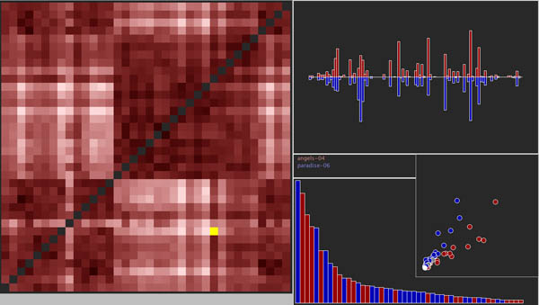
While the main grid can reveal interesting relationships between texts, it hides the underlying factors that account for differences or similarities, the linguistic richness that DocuScope counts and categorizes so meticulously. However, LATtice provides multiple, overlapping, visualizations to help us explore the relationship between any two texts in the corpus at the level of individual LATs. Any text-pair on the grid can be “locked” by clicking on it, allowing the user to move to the LATs to explore them in more detail. The top right panel shows how LATs from both the texts relate to each other. The text on the X axis of the heatmap is represented in red and the one on the Y axis is represented in blue in the histogram for side by side comparison. All the other panels follow this red-blue color coding for the text-pair. The bottom panel displays only the LATs whose counts are most dissimilar. These are the LATs we will want to focus on in most cases as they account most for the “difference” between the texts in DocuScope’s analysis. If a bar in this panel is red it signifies that for this LAT, the text on the X axis (our ‘red’ text) had a higher relative frequency count while a blue bar signals that the Y axis text (our ‘blue’ text) had a higher count for a particular LAT. This panel lets us quickly explore exactly on what aspects texts differ from each other. Finally, LATtice also produces a scatterplot as a very quick way of looking at “similarity” between texts. It plots LAT readings of the two texts against each other and color codes the dots to indicate which text has a higher relative frequency for a particular LAT (grey dots indicate that both LATs have the same value). The “spread” of dots gives a rough indication of difference or similarity between texts: a larger spread indicates dissimilar texts and dots clustering around the diagonal indicate very similar texts.
You can try LATtice out with two sample data-sets by clicking on the links below. The first is drawn from the plays of Shakespeare which are in this case arranged in rough chronological order. As Hope and Witmore’s work has demonstrated, the possibilities opened up by applying DocuScope to the Shakespeare corpus are rich and hopefully exploring the relationship between individual plays on the grid will produce new insights and new lines on inquiry. The second data-set is experimental – it tries to use DocuScope not to compare multiple texts but to explore a single text – Milton’s Paradise Lost – in detail. It might give us insights about how digital techniques can be applied on smaller scales with well-curated texts to complement literary close-reading. The poem was divided into sections based on the speakers (God, Satan, Angels, Devils, Adam, Eve) and the places being described (Heaven, Hell, Paradise). These chunks were then divided into roughly three hundred line sections. As an example, we might notice straightaway that speakers and place descriptions seem to have very distinct characteristics. Speeches are broadly similar to each other as are place descriptions. This is not unexpected, but what accounts for these similarities and differences? Exploring the LATs helps us approach this question with a finer lens. Paradise, for example, is full of “sense objects” while Godly and angelic speech does not refer to them as often. Does Adam refer to “authority” more when he speaks to Eve? Does Satan’s defiance leave a linguistic trace that distinguishes him from unfallen angels? Hopefully LATtice will help us explore and answer such questions and let us bring DocuScope’s data closer to the nuances of literary reading.
Finally, a few technical notes: The above links should load LATtice with the appropriate data-sets. Of course, you will need to have Java installed on your machine and to have applets enabled in your browser. You can also download LATtice and the sample data-sets, along with detailed instructions, as stand-alone applications for the following platforms:
There are a few advantages to doing this. First, the standalone version offers an additional visualization panel which represents the distribution of LATs as box-and-whisker plots and shows where the text-pair’s frequency counts stand relative to the rest of the corpus. Secondly, the standalone application can make use of the entire screen, which can be a great advantage for larger and higher resolution monitors.